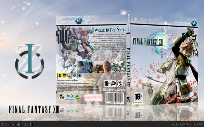
The back seems a little cluttered but the front is rather good. I don't like what's been done to the template though, should've been kept normal instead of altering the PS3 banner IMO. Sort that and then I'll FAV
In my eyes, there's quite a bit that needs worked on.
The first thing I noticed was the template. There are a few occasions in which I don't mind custom templates, but most of the time it feels unnecessary. The transparent banner adds nothing but the inability to easily read the logos. The official would be much better.
Secondly, the most glaring issue aside from the template is the incredibly busy back layout. There's simply too many images clashing with each other, and it's difficult to discern what's going on. The crowded background also makes it difficult to read the synopsis, so I urge you to rethink the back layout.
On the positives, I do what you've done with the front. The rose petals idea is something I always wanted to do with a FFXIII cover, but I couldn't work it out. The faded petals would probably look better behind Odin though.
The back looks cluttered as has been said, and the font on the back is a bit plain. Also, the background behind the box matches the box too closely. It is less than clear were the box ends and background begins without looking closely. Other than that, it's pretty great.
 Final Fantasy XIII Box Cover Comments
i love love LOVE IT :O
fav +author fav :O
10/10
[ Reply ]
Thanks alot. Box took alot of work
[ Reply ]
#2, you deserve it :O
it is so f*cking EPIC :OOO
[ Reply ]
The back seems a little cluttered but the front is rather good. I don't like what's been done to the template though, should've been kept normal instead of altering the PS3 banner IMO. Sort that and then I'll FAV
[ Reply ]
In my eyes, there's quite a bit that needs worked on.
The first thing I noticed was the template. There are a few occasions in which I don't mind custom templates, but most of the time it feels unnecessary. The transparent banner adds nothing but the inability to easily read the logos. The official would be much better.
Secondly, the most glaring issue aside from the template is the incredibly busy back layout. There's simply too many images clashing with each other, and it's difficult to discern what's going on. The crowded background also makes it difficult to read the synopsis, so I urge you to rethink the back layout.
On the positives, I do what you've done with the front. The rose petals idea is something I always wanted to do with a FFXIII cover, but I couldn't work it out. The faded petals would probably look better behind Odin though.
[ Reply ]
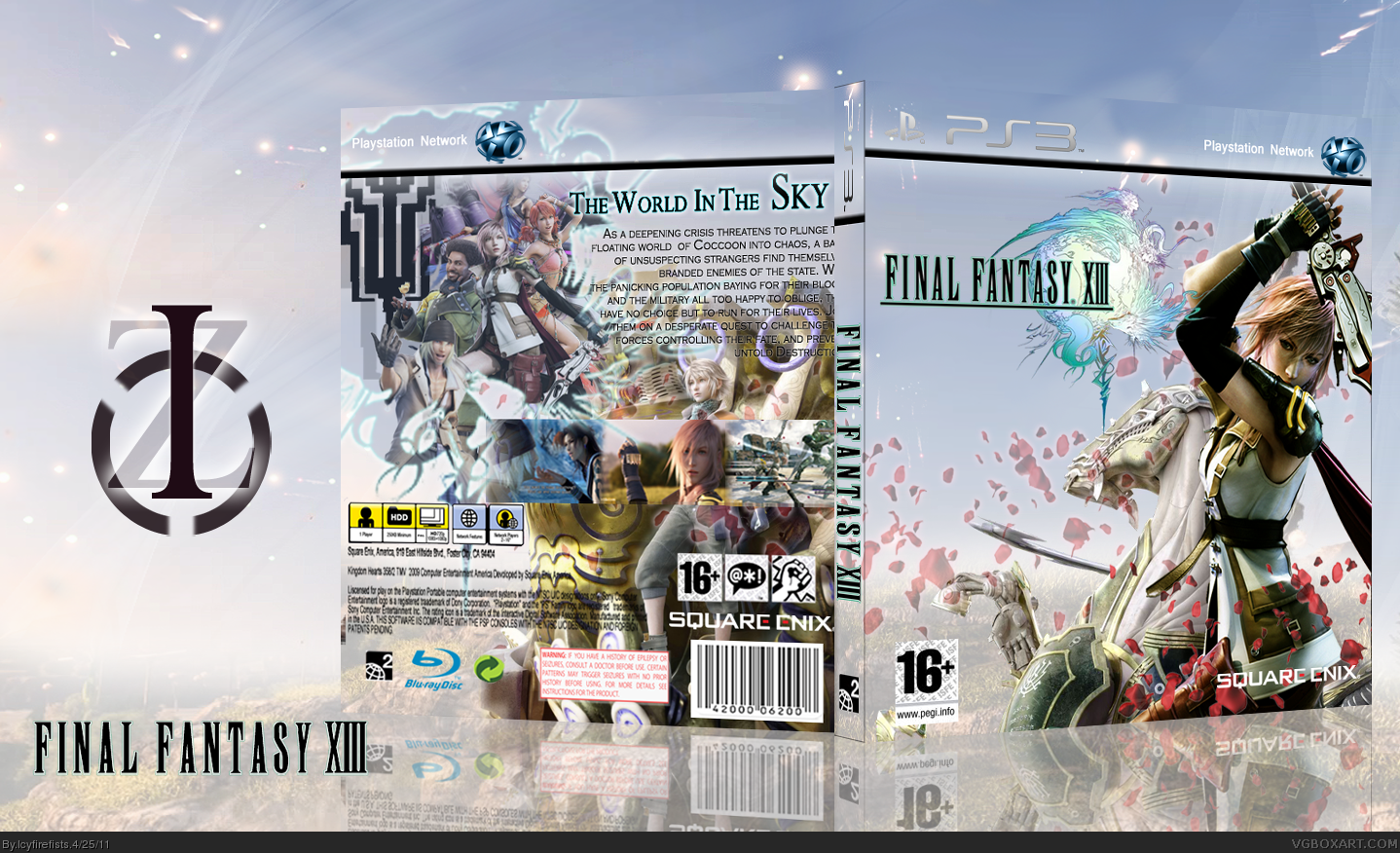
Okay, how's that this time. i faded the eidolon on the back, but i still wanted to keep it there. Thanks #5
[ Reply ]
I think you should use a normal template, also I dont like that there are 2 Lightnings in the back.
I really liked the front.
[ Reply ]
The back looks cluttered as has been said, and the font on the back is a bit plain. Also, the background behind the box matches the box too closely. It is less than clear were the box ends and background begins without looking closely. Other than that, it's pretty great.
[ Reply ]
This is pretty nice. Not perfect, but you have something really cool going with this.
[ Reply ]
Thanks alot. Took a great deal of planning.
[ Reply ]