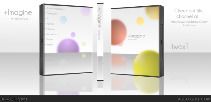
I phoned up my cousin, tonkonton, and asked him if I could make a box for his great music. Surprisingly, he said yes, thus allowing this box to exist. Check out his YouTube channel!
*edit*
If you listen to his songs, you can see why this is simplistic. :D
Yeah, I made this on a 360 template...
Credit to Ninty
His channel: link
I honestly don't pay much attention to presentation, but the box is actually pretty damn good. Very simple, but pleasant to look at. It invokes a lot of mystery, for me at least, so I'm going to go check out your cousin's music...
Completely agree with YoshiStar. Presentation is way too similar to the box. Also, text on the back is way too close to the edge. Move it more towards the middle.
I'm going to go the other route and say that I actually really like the presentation. Yes, the box blends with it, but it adds to the ethereal, simple qualities of the box. It looks beautiful.
 +Imagine Cover Comments
I phoned up my cousin, tonkonton, and asked him if I could make a box for his great music. Surprisingly, he said yes, thus allowing this box to exist. Check out his YouTube channel!
*edit*
If you listen to his songs, you can see why this is simplistic. :D
Yeah, I made this on a 360 template...
Credit to Ninty
His channel: link
Edited at 1 decade ago
[ Reply ]
I really like it, but horrible presentation. It makes it look like the box is transparent.
One fundamental rule of presentations - Never make it look like your box.
Something that suits your box and goes well together with it is good, but never something so similar ...
[ Reply ]
#2, I'll try that...
Edited at 1 decade ago
[ Reply ]
I honestly don't pay much attention to presentation, but the box is actually pretty damn good. Very simple, but pleasant to look at. It invokes a lot of mystery, for me at least, so I'm going to go check out your cousin's music...
[ Reply ]
#4, hooray for my cousin! :D
[ Reply ]
Completely agree with YoshiStar. Presentation is way too similar to the box. Also, text on the back is way too close to the edge. Move it more towards the middle.
[ Reply ]
I'm going to go the other route and say that I actually really like the presentation. Yes, the box blends with it, but it adds to the ethereal, simple qualities of the box. It looks beautiful.
[ Reply ]
#7, wow, thanks!
[ Reply ]
You have a beautiful sense of color is,Nice Box . . .
[ Reply ]