#3, Yeah, true, but it's mainly from the use of the same resources (official site, renders, tothegame.com etc).
And of course I tidied the legal info due to the advice you gave me on my KH box.
I hope you're not offended.
#2, #4, Thank you. :)
both front and back are near perfect! my only advice is, to try to make the font in the top left corner a bit stronger.
I know it's hard to find a font that fits the MK Logo.
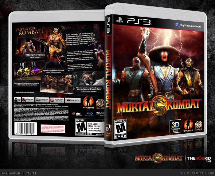
The back is pretty much perfect. It fits the game, there isn't too much text and it's easy to read, and everything goes together. As for the front, it's definitely not bad, but it's a little generic and some of the artwork is blurry. Other than that, I don't have any problems with this.
 Mortal Kombat (2011) Box Cover Comments
This has been in the works for a while but I decided to start on it again a few days ago.
Thanks to the users who replied in my WiP thread and enjoy.
[ Reply ]
I love this, I can't find anything wrong with this, good job.
[ Reply ]
Good job, I can't help but notice the similarities with the back and mine.
[ Reply ]
LOVE IT!
[ Reply ]
#3, Yeah, true, but it's mainly from the use of the same resources (official site, renders, tothegame.com etc).
And of course I tidied the legal info due to the advice you gave me on my KH box.
I hope you're not offended.
#2, #4, Thank you. :)
[ Reply ]
Make the logo less yellow then this'll be near perfect.
[ Reply ]
Make the logo less yellow then this'll be near perfect.
[ Reply ]
Amazing stuff.
[ Reply ]
#6-#7, Thanks for the suggestion but it looks fine to me. :/
#8, Thanks.
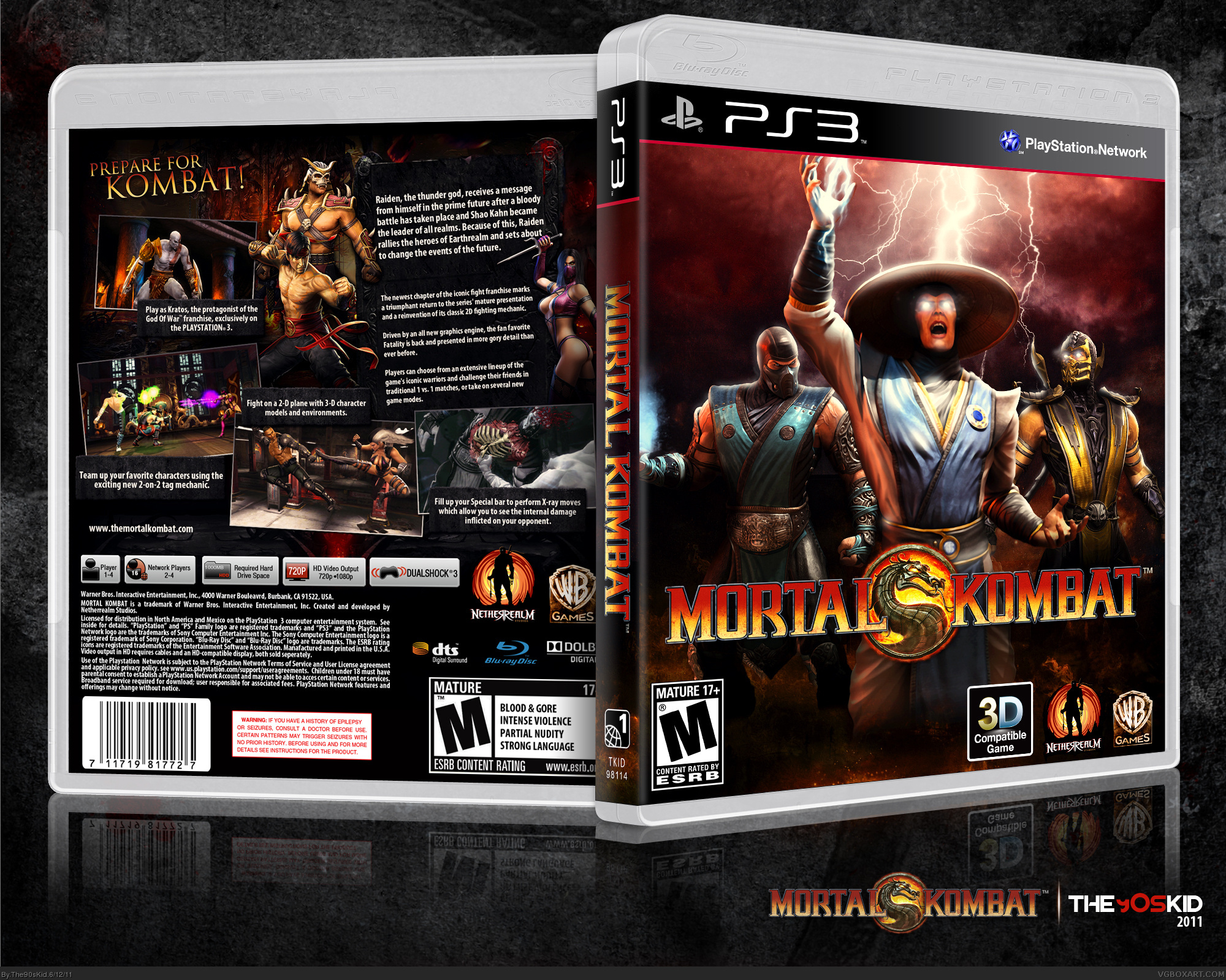
Updated, I fixed around Sub-Zero's legs and added some more fire effects to the bottom.
[ Reply ]
Really good!
[ Reply ]
Amazing, I like the strong contrast.
You gonna upload the printable?
[ Reply ]
#10-#11, Thanks guys and yes I will upload a printable.
[ Reply ]
It reminds me of Throavium's boxes, but you did a great job here. :D
[ Reply ]
#13, Thanks, but I couldn't hold a candle to Throavium.
Printable's up if anybody's interested.
[ Reply ]
both front and back are near perfect! my only advice is, to try to make the font in the top left corner a bit stronger.
I know it's hard to find a font that fits the MK Logo.
Edited at 1 decade ago
[ Reply ]
The back is pretty much perfect. It fits the game, there isn't too much text and it's easy to read, and everything goes together. As for the front, it's definitely not bad, but it's a little generic and some of the artwork is blurry. Other than that, I don't have any problems with this.
[ Reply ]