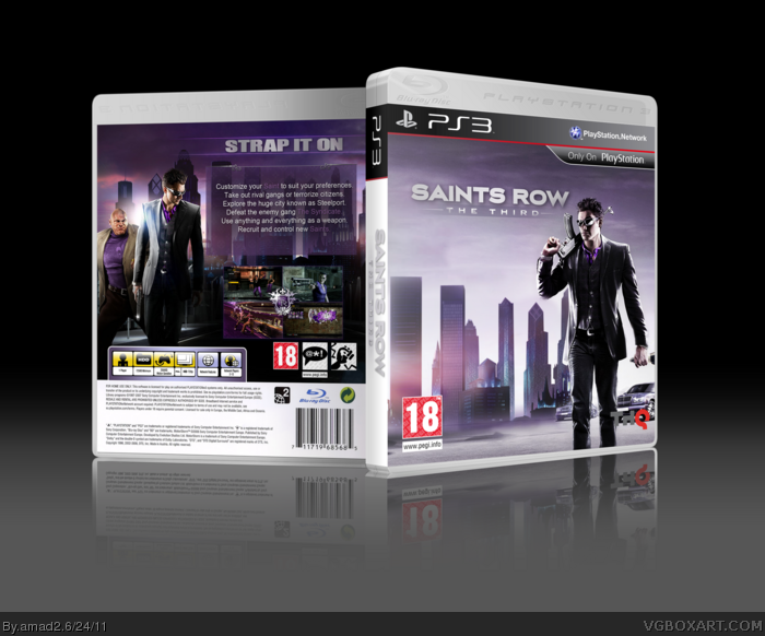
So this is my box for the Theme of the Month.
Thanks to TMRD for helping me out with this and Squall for some beautiful advice!
Cred to Sens for the 3D temp.
very slick box, love the purple.
although, I'm not in to the Saint Row Series
(haven't played the previous games) this would
consider me to make me buy it, nice job.
For a game that apparently thrives on over-the-top action and mayhem, the cover's a bit reserved. I enjoy the lighting on the back, which you'd have been wise to carry over to the front. There's potential here, but it needs something more.
 Saints Row: The Third Box Cover Comments
So this is my box for the Theme of the Month.
Thanks to TMRD for helping me out with this and Squall for some beautiful advice!
Cred to Sens for the 3D temp.
[ Reply ]
very slick box, love the purple.
although, I'm not in to the Saint Row Series
(haven't played the previous games) this would
consider me to make me buy it, nice job.
Edited at 1 decade ago
[ Reply ]
I like it, the front seems a little bare though. I'm thinking you could add a fleur-de-lis or something behind the logo, just to spice it up.
The back's nice, but I really think you could benefit from adding a stroke to the text (the purple really blends into the background).
Oh, and I just noticed you used screens from the 2nd one.
Edited at 1 decade ago
[ Reply ]
As AgentLampshade said, it is bare.
The front, back, and spine seem to have a lot of blank space.
[ Reply ]
For a game that apparently thrives on over-the-top action and mayhem, the cover's a bit reserved. I enjoy the lighting on the back, which you'd have been wise to carry over to the front. There's potential here, but it needs something more.
Edited at 1 decade ago
[ Reply ]