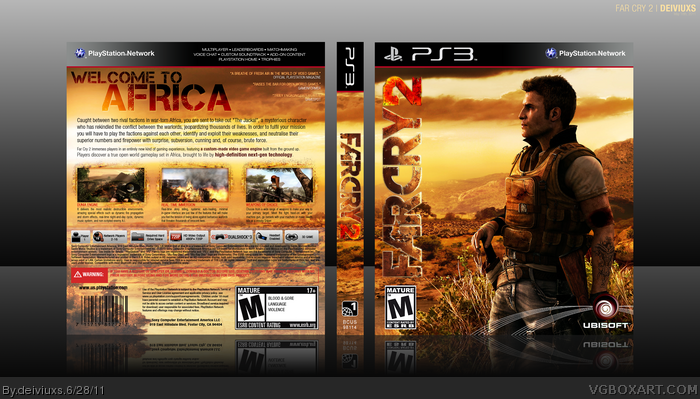
Very nice! Crisp, clean, and put together well. The back is really a work of fine craftsmanship: picture backgrounds have a penchant for obscuring the legal text, but you nailed it! I especially like the quotes in the upper right corner: they don't feel forced, the outline behind blends in while also standing out well, and it's a nice, authentic touch.
I don't think I've much right to offer tips to someone of your rank, but I hope you don't mind if I just state two of my opinions for suggestions:
The image you selected for the front is spectacular; it's also very crisp and clean, and really conveys the feel of the game to a tee without oversaturating the eye with stacks of character portraits or unnecessary detail. However, I think a pair of the logos you've put on top of it are detracting from the effect. In the first place, as others above have suggested, I think you should see how the box art looks if you remove the signature lines behind the Ubisoft logo; I don't know if that's how they do it now, but sometimes authenticity should be sacrificed for the sake of design!
Additionally, (keep in mind, this is merely my opinion :)!) I think that your placement and orientation of the logo is creating a focal conflict for the viewer. Here with have this perfect image of [I never played Far Cry 2 so I don't know what the protagonist is named!] oriented at a very nice aesthetic distance from the right margin of the box, but then the 90-degree vertical logo flushed towards the opposite side is pulling the center of attention in that direction. It causes the onlooker to look in between those two things, and...well, there's nothing there, and they should be looking at that lovely front image of yours! You may want to experiment with the logo placement. The way I see it, you have a golden opportunity with the front design you chose; there's an almost horizontal array of hills right behind the protagonist, at an angle that would not make a string of text too slanted to be illegible or distracting. Maybe...try putting the logo on that slant, and then resizing it, and removing part of the bottom in such a way so that it looks like it's "behind" those hills? I don't know. Just a thought! It may well just be a difference in aesthetic preferences, but I at least wanted to bring it up to you :). It's a wonderful box as it is; always nice when your effort yields great fruit!
#4, Ok...why aren't you "feeling" the front?
#5, Hmm...I see how the cover looks without the lines.
#6, Logo is hard to see..really? I can see it perfectly (especially in full view).
#7, Now that's a comment I am really proud to receive. Everyone (including me) should take your comment as an example of how properly to leave a critical comment. Love it!
First of all, let me say that I do not care about ranks on this site. I take EVERY comment into consideration (as long as its not spam) and I do not care who leaves it.
Now onto the few points you brought up; a) I will try to remove Ubi lines and see how design looks but honestly I don't see lines being as a distraction and I find that they add a subtle detail to the design, b) as far as the logo placement, I chose vertical orientation because I wanted this cover to be a bit different from others and a typical horizontal placement you see on other box arts. Also, left seemed to be pretty empty without nothing on it. I will, however, try and implement your logo suggestion behind mountains and see how that will look.
Again, thanks to all who left feedback. I guess this site is not so dead after all. :)
It's rare that I find a back that utilizes only the most basic of aspects, without any character-specific artwork/creating editing/etc., and still manages to look as appealing to the eye as this. It may not try anything new, but it's straight to the point and clearly put together with quality material and a good eye for design. It's essentially what I'd expect most official backs to look like, if those hired for the job knew what they were doing.
As for the vertical issue, another issue being that the complex texturing and similar color tones collide with that of the background, making it difficult to make out at first glance. This is apparent on the spine too, and a subtle drop shadow could fix the problem.
Great box, though (Or seems like) you used a real life picture for the background, and this gets extremely noticeable at some parts, especially the bushes around the guy's legs, contrasting and making such parts look bad and unrealistic. I would've liked that you had tried to simulate the grunge efffect of the logo on the tagline. Btw, the "2" on the spine's logo is hard to read.
#14, Actually, the background image is not a real life picture. It's actually an image from the game. As far as the tagline goes, I wanted it to blend in to the scenery that's why I didn't make it look like a logo.
Greatly appreciate all the comments. I might tweak some things around, but honestly, I'm pretty happy with the way the cover looks.
I really like it. There are, however, a few things I would adjust. For starters, I really don't feel like the logo is visible enough, you need to do something to make it pop. Secondly, I am not a fan of the font you used for the synopsis. I don't think it goes with the rest of the design. Also, the background is pixelated in full view. Also, I know it sounds petty, but the lack of plastic irritates me, I don't like the fact that it is just a printable template. Presentation is as important as the box.
#16, Thanks for your feedback but as far as the presentation goes, I kinda wanted to go for something different. I've done so many PS3 boxes with plastic that I wanted to try something new.
#17, All of my covers look way better in full size! :)
I know its well executed, but for some reason its just not sitting right with me. I like the front quite a bit, but the back just seems crowded with text, and for that reason, a little lacking.
only thing i could say is the copyright info ect. text block at the back
could be black and the text white, this would seperate the game info from the legal info.
now it seems that all the text is about the game.
and the Far Cry 2 logo should have a black outline.
#24, That "stroke" around the logo is actually how the original logo is. I did not do any editing to the logo itself.
#25, Ok, I see what you mean. I still like it this way better because you can still see the background scenery and it all flows together better (at least to my eyes).
maybe, you could slowly fade the background at the end so the scenery is still showing
and the text is better readable. just my opinion, if you like it yourself, than don't change it.
it really looks like there's some kind of white glow around the logo?
it really doesn't work with the background image. give it more contrast
or add a light gradient from the left to make the logo stand out more.
 Far Cry 2 Box Cover Comments
Please view full size.
Thanks! :)
[ Reply ]
Nice one, looks even better full size!
[ Reply ]
You astound again.
[ Reply ]
I like the cleanness. But not really feeling the front.
[ Reply ]
Its awesome but I don't like those lines behind the Ubisoft logo.
[ Reply ]
I love it, but the logo is hard to see.
[ Reply ]
Very nice! Crisp, clean, and put together well. The back is really a work of fine craftsmanship: picture backgrounds have a penchant for obscuring the legal text, but you nailed it! I especially like the quotes in the upper right corner: they don't feel forced, the outline behind blends in while also standing out well, and it's a nice, authentic touch.
I don't think I've much right to offer tips to someone of your rank, but I hope you don't mind if I just state two of my opinions for suggestions:
The image you selected for the front is spectacular; it's also very crisp and clean, and really conveys the feel of the game to a tee without oversaturating the eye with stacks of character portraits or unnecessary detail. However, I think a pair of the logos you've put on top of it are detracting from the effect. In the first place, as others above have suggested, I think you should see how the box art looks if you remove the signature lines behind the Ubisoft logo; I don't know if that's how they do it now, but sometimes authenticity should be sacrificed for the sake of design!
Additionally, (keep in mind, this is merely my opinion :)!) I think that your placement and orientation of the logo is creating a focal conflict for the viewer. Here with have this perfect image of [I never played Far Cry 2 so I don't know what the protagonist is named!] oriented at a very nice aesthetic distance from the right margin of the box, but then the 90-degree vertical logo flushed towards the opposite side is pulling the center of attention in that direction. It causes the onlooker to look in between those two things, and...well, there's nothing there, and they should be looking at that lovely front image of yours! You may want to experiment with the logo placement. The way I see it, you have a golden opportunity with the front design you chose; there's an almost horizontal array of hills right behind the protagonist, at an angle that would not make a string of text too slanted to be illegible or distracting. Maybe...try putting the logo on that slant, and then resizing it, and removing part of the bottom in such a way so that it looks like it's "behind" those hills? I don't know. Just a thought! It may well just be a difference in aesthetic preferences, but I at least wanted to bring it up to you :). It's a wonderful box as it is; always nice when your effort yields great fruit!
Edited at 1 decade ago
[ Reply ]
It's not really very original, but it certainly looks nice.
[ Reply ]
#4, Ok...why aren't you "feeling" the front?
#5, Hmm...I see how the cover looks without the lines.
#6, Logo is hard to see..really? I can see it perfectly (especially in full view).
#7, Now that's a comment I am really proud to receive. Everyone (including me) should take your comment as an example of how properly to leave a critical comment. Love it!
First of all, let me say that I do not care about ranks on this site. I take EVERY comment into consideration (as long as its not spam) and I do not care who leaves it.
Now onto the few points you brought up; a) I will try to remove Ubi lines and see how design looks but honestly I don't see lines being as a distraction and I find that they add a subtle detail to the design, b) as far as the logo placement, I chose vertical orientation because I wanted this cover to be a bit different from others and a typical horizontal placement you see on other box arts. Also, left seemed to be pretty empty without nothing on it. I will, however, try and implement your logo suggestion behind mountains and see how that will look.
Again, thanks to all who left feedback. I guess this site is not so dead after all. :)
[ Reply ]
It's rare that I find a back that utilizes only the most basic of aspects, without any character-specific artwork/creating editing/etc., and still manages to look as appealing to the eye as this. It may not try anything new, but it's straight to the point and clearly put together with quality material and a good eye for design. It's essentially what I'd expect most official backs to look like, if those hired for the job knew what they were doing.
As for the vertical issue, another issue being that the complex texturing and similar color tones collide with that of the background, making it difficult to make out at first glance. This is apparent on the spine too, and a subtle drop shadow could fix the problem.
Edited at 1 decade ago
[ Reply ]
Fantastic!!
[ Reply ]
Flawless
[ Reply ]
pretty damn epic man!
[ Reply ]
Great box, though (Or seems like) you used a real life picture for the background, and this gets extremely noticeable at some parts, especially the bushes around the guy's legs, contrasting and making such parts look bad and unrealistic. I would've liked that you had tried to simulate the grunge efffect of the logo on the tagline. Btw, the "2" on the spine's logo is hard to read.
Excellent, althought there's things I don't like.
Edited at 1 decade ago
[ Reply ]
#14, Actually, the background image is not a real life picture. It's actually an image from the game. As far as the tagline goes, I wanted it to blend in to the scenery that's why I didn't make it look like a logo.
Greatly appreciate all the comments. I might tweak some things around, but honestly, I'm pretty happy with the way the cover looks.
[ Reply ]
I really like it. There are, however, a few things I would adjust. For starters, I really don't feel like the logo is visible enough, you need to do something to make it pop. Secondly, I am not a fan of the font you used for the synopsis. I don't think it goes with the rest of the design. Also, the background is pixelated in full view. Also, I know it sounds petty, but the lack of plastic irritates me, I don't like the fact that it is just a printable template. Presentation is as important as the box.
[ Reply ]
Wow, looks way better in full size. The design and the colors are beautiful, and the back is well organized. Good job.
[ Reply ]
#16, Thanks for your feedback but as far as the presentation goes, I kinda wanted to go for something different. I've done so many PS3 boxes with plastic that I wanted to try something new.
#17, All of my covers look way better in full size! :)
[ Reply ]
I mean i think its simple, but its nice. I only wish the whiten stroke around 'Far Cry' was black. Otherwise it looks official.
[ Reply ]
I absolutely love the back.
[ Reply ]
I know its well executed, but for some reason its just not sitting right with me. I like the front quite a bit, but the back just seems crowded with text, and for that reason, a little lacking.
[ Reply ]
only thing i could say is the copyright info ect. text block at the back
could be black and the text white, this would seperate the game info from the legal info.
now it seems that all the text is about the game.
and the Far Cry 2 logo should have a black outline.
other than this, it's a fine excecuted boxart.
[ Reply ]
#21, haha..I guess to each its own. The guy above you seems to have a different opinion on the back. :) Thanks for the comment though!
#22, I'm not sure what exactly you're talking about but if I were to make legal info white then it would stand out too much and be hard to read.
[ Reply ]
#23, They mean the white stroke around the 'Far Cry' logo on the front. it looks off somehow.
[ Reply ]
#23, True, but I meant make the legal info white and put a 'text block' underneath the text like this link for example but than inverted.
[ Reply ]
#24, That "stroke" around the logo is actually how the original logo is. I did not do any editing to the logo itself.
#25, Ok, I see what you mean. I still like it this way better because you can still see the background scenery and it all flows together better (at least to my eyes).
[ Reply ]
maybe, you could slowly fade the background at the end so the scenery is still showing
and the text is better readable. just my opinion, if you like it yourself, than don't change it.
it really looks like there's some kind of white glow around the logo?
it really doesn't work with the background image. give it more contrast
or add a light gradient from the left to make the logo stand out more.
Edited at 1 decade ago
[ Reply ]
Nice!
[ Reply ]