[ Box updated on July 2nd, 2011 ] [ original ]
 The Legend of Zelda: Skyward Sword Box Cover Comments
Comment on stevanR80's The Legend of Zelda: Skyward Sword Box Art / Cover.
[ Box updated on July 2nd, 2011 ] [ original ]
Comment on stevanR80's The Legend of Zelda: Skyward Sword Box Art / Cover.
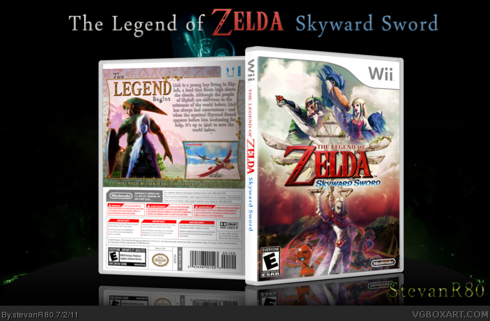
Not completely done with this. Just wanted to release it before I go on vacation. Be back in 5 weeks
[ Reply ]
Not really digging the front. Alot going on and it seems like the big bird is the main character.
[ Reply ]
Looking nice stevan. The front is a little hard to make out due to the all the bright colors. Contrast is a good tool to use to make things stand out. As for the back, there is nothing wrong but it is pretty basic. A few more screenshots or maybe crafting the screenshots in a more creative way might make the box stand out a bit more. Overall tho, a very nice job.
[ Reply ]
Like jevan said, A lot of emphasis is on the bird, even even the one screenshots. I say play around with the front, get rid of the enemies behind the guy at the bottom, and play with the contrast like stevencho said.
[ Reply ]
back looks good, but the front seems like there is a lot going on for a legend of zelda box
[ Reply ]
Thanks for all the advice guys, like I said it's not finished so your advice helps a lot. I do have another version of the front without the border though, but I can't really put it up because like I said I won't be here for five weeks. But look at my thread in the forum, I have all previous versions there.
Edited at 1 decade ago
[ Reply ]
This turned out rather well. The back is very well made and is worth a fav alone just because of that. The front seems a bit more cluttered. To me the addition of the border on the front is what makes it overly cluttered, it might just be me, but I would suggest removing it.
[ Reply ]
You've the right idea, for the front, but some things could be changed for the better.
First of all, the colors and lighting. I assume the contrasting differences between the upper and lower halves is intentional (good/bad, light/dark), but the top is way too bright. The white glow in general is pretty distracting, and easing up, with a blue sky in it's place, would be easier on the eyes and maintain the contrasting sides.
Secondly, on the front, the character arrangements. It's somewhat unbalanced. For one thing, Link should have a bit more of the spotlight. The lower half could do better to balance out with the upper, too. Perhaps some larger creatures behind Ghirahim to fill the empty voids on either side of him?
I'd also like to side with RoarShark on the border. If you'd like to have a border at all, something more akin to the back's would work.
I've nothing to say about the back that Stevencho didn't already mention. It's pretty solid.
[ Reply ]
This is really nice - apart from the crit given by both Stevencho and sd1833, I'd suggest changing the back description text to black.
[ Reply ]
Thanks a lot for the comments guys! I just got wifi where I'm vacationing at and I though id read the comments. I do have an update for you all with a few changes such as the removal of the front border. I'll update as soon as I can
[ Reply ]
*Updated*
[ Reply ]
Looks great! However, I feel Link needs to be in the spotlight more. I'm not entirely sure how you could arrange it in a way that would put more focus on him, but try to think of something.
That small issue aside, I do like this enough to favorite. Keep it up, man. I can see you have a lot of potential. :)
[ Reply ]
#12 Thanks :). I know that Link, being the main character and all, should stand out the most. But i also want the viewers to see whats new almost right away, and that would be the bird. To me it's better to put a TINY bit more spotlight on the bird so it looks like a new game if that makes any sense
[ Reply ]
Master F'in Works. And because of this box, I'm seriously considering getting a Wii to play this game.
[ Reply ]
#14 hahaha easy man! I wouldnt say master works lol but thanks a lot I appreciate it
[ Reply ]