#1 Thanks man!
#2 Thank you! I had a normal logo at first, but it looked to boring xD
#3 Telling me "It looks odd" and "It looks bad" doesn't tell me anything.
#7, That's the big problem with using this otherwise perfect template. It looks absolutely real, but it doesn't particularly impress as a work of design-art.
It looks very official, but I just can't get over the logo there. I feel like a normal space would have been sufficient. Everything else looks spot on, though.
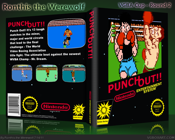
 Punch-Out!! Box Cover Comments
Oh, Hell Yeah! Classic....
I love this game and don't forget your cover, fave ;)
p.s. Could be a fun name for a new competition 'The World Video Game Boxing Art Competition' lol
Edited at 1 decade ago
[ Reply ]
I don't like that logo. Despite it looks great.
[ Reply ]
Well, like I said in the WIP, the logo looks odd on the front. The text on the back it's bad. The back looks pretty empty and boring.
[ Reply ]
#1 Thanks man!
#2 Thank you! I had a normal logo at first, but it looked to boring xD
#3 Telling me "It looks odd" and "It looks bad" doesn't tell me anything.
[ Reply ]
#4, I don't know why, it just looks odd for me. And when I mean bad, well, I mean the text is poor.
[ Reply ]
I loved this game and the box fits it exactly.
[ Reply ]
I gotta give you points for using pixel art where it's supposed to be used. Other than that, it's a pretty standard NES box.
[ Reply ]
#7, That's the big problem with using this otherwise perfect template. It looks absolutely real, but it doesn't particularly impress as a work of design-art.
This really does look legitimate, though.
[ Reply ]
looking good overall, but the size difference of the 2 characters on the front bugs me a little.
other then that, not bad
[ Reply ]
This is pretty much a standard, classic official looking box. Nicely done.
[ Reply ]
It looks very official, but I just can't get over the logo there. I feel like a normal space would have been sufficient. Everything else looks spot on, though.
[ Reply ]