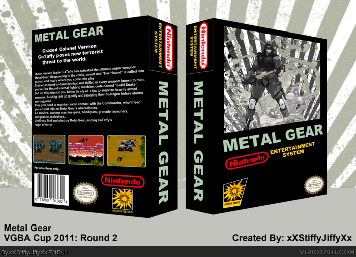
Alright so here's my entry for Round 2 of the 2011 VGBA Cup! Took me a few days to make but I think it came out good :) got the inspiration from playing the original Metal Gear games on my emulator
Ronthis is right about the sunburst effect. The artwork looks very stylized in a modern way as well. I'm just not really feeling it. The meat and potatoes of this is the front image, and if you take away that NES template, it just doesn't fit with the concept of the competition at all.
Don't get me wrong, it doesn't look bad. It just doesn't fit with the theme very well.
I agree with the others. It just falls short of looking 'retro.' I am not a huge fan of the art on the front, and it seems like there is just something missing from the back. But by no means is this a bad box.
Everything about the art used on the front ruins the feel of the time period. The rest of the box is a by-the-numbers NES box with the Nintendo template. I'm okay with that, to change things up. But that art sticks out like a sore thumb.
 Metal Gear Box Cover Comments
Not bad, but it looks bland in this template. Konami games for NES had their own template: link
Though Metal Gear didn't use that template: link
Also the artwork on the front looks much more like Metal Gear Solid than Metal Gear.
[ Reply ]
Alright so here's my entry for Round 2 of the 2011 VGBA Cup! Took me a few days to make but I think it came out good :) got the inspiration from playing the original Metal Gear games on my emulator
[ Reply ]
The sunburst effect ruins it, it makes it look less 80's and more 21st century.
[ Reply ]
Ronthis is right about the sunburst effect. The artwork looks very stylized in a modern way as well. I'm just not really feeling it. The meat and potatoes of this is the front image, and if you take away that NES template, it just doesn't fit with the concept of the competition at all.
Don't get me wrong, it doesn't look bad. It just doesn't fit with the theme very well.
[ Reply ]
I agree with the others. It just falls short of looking 'retro.' I am not a huge fan of the art on the front, and it seems like there is just something missing from the back. But by no means is this a bad box.
[ Reply ]
Everything about the art used on the front ruins the feel of the time period. The rest of the box is a by-the-numbers NES box with the Nintendo template. I'm okay with that, to change things up. But that art sticks out like a sore thumb.
[ Reply ]