GAH! D:
After about 4 long days of work I'm finished with my box. I'm pretty satisfied with it but it's up to you guys to tell me if it's good. ;)
Credits...
Ronthis for template
Sprite INC and Mega Man Wiki for sprites
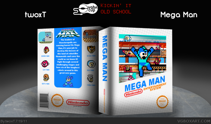
I'd suggest removing that filter on the entire cover and find away to add at least 2 screenshots. Screenshots on retro covers are essential because back then that was the only way to determine what the actually game looked liked, well, that and maybe magazines.
The 3D effects and texture both need a LOT of work. The actual box is ok, the back is pretty good but the front isn't working for me, the blur effects take away a lot from the retro feel, also you used the NES template instead of the capcom one.
The 3D isn't right, try using a different angle. The paper takes a lot away, considering it is realistic and the art is Pixel Art. The MEGAMAN logo on the front is not the best, try skewing it more to fit the skewing of the front image. Try to throw in the Adventure Series logo. If you really want it to look retro, try adding the Wind filter on Rock. The back is great, I love it, except I don't think his name was "Fire Man" I think it was "Heat Man". And as Pan also stated, try to go with the traditional Capcom Template and not the Nintendo one.
I suggest a darker coloured template, a less blurry Megaman at the front and a
more pixelated Megaman at the back. besides those things, I think it has potential.
Not bad. Actually nice, though I think you should place the shadow of the box under it, not over it. Also, I dislike the way the two parts of the box overlap.
The back should be smaller than the front due to depth and distance but the texture removed makes it look a lot better. Also do you have a shadow on the bottom of the whole thing or is that a gray shade on the box? I think you could remove it because it makes the box look like it has a light shining in the middle of it, not on the whole thing.
Having a shadow on the bottom and on the corners gives the impression of two light sources one above and one on the side.
 Mega Man Box Cover Comments
GAH! D:
After about 4 long days of work I'm finished with my box. I'm pretty satisfied with it but it's up to you guys to tell me if it's good. ;)
Credits...
Ronthis for template
Sprite INC and Mega Man Wiki for sprites
[ Reply ]
I'd suggest removing that filter on the entire cover and find away to add at least 2 screenshots. Screenshots on retro covers are essential because back then that was the only way to determine what the actually game looked liked, well, that and maybe magazines.
Edited at 1 decade ago
[ Reply ]
#2, thanks I'll try to put some screens...
...which I just did!
I'm going to sleep now.
Edited at 1 decade ago
[ Reply ]
The 3D effects and texture both need a LOT of work. The actual box is ok, the back is pretty good but the front isn't working for me, the blur effects take away a lot from the retro feel, also you used the NES template instead of the capcom one.
[ Reply ]
The 3D isn't right, try using a different angle. The paper takes a lot away, considering it is realistic and the art is Pixel Art. The MEGAMAN logo on the front is not the best, try skewing it more to fit the skewing of the front image. Try to throw in the Adventure Series logo. If you really want it to look retro, try adding the Wind filter on Rock. The back is great, I love it, except I don't think his name was "Fire Man" I think it was "Heat Man". And as Pan also stated, try to go with the traditional Capcom Template and not the Nintendo one.
[ Reply ]
I suggest a darker coloured template, a less blurry Megaman at the front and a
more pixelated Megaman at the back. besides those things, I think it has potential.
Edited at 1 decade ago
[ Reply ]
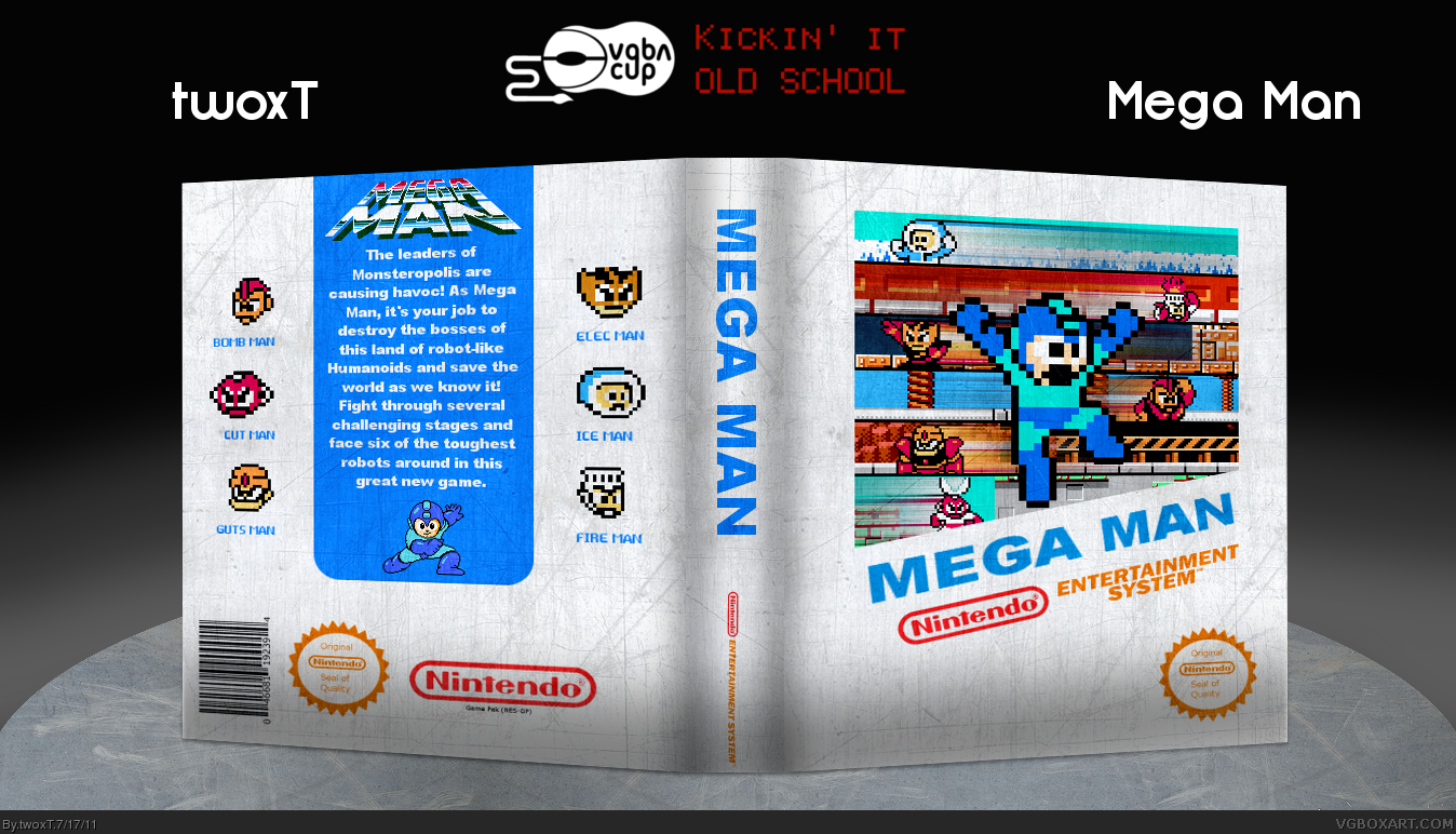
The big issues are the paper texture, the Nintendo template, and the modern effects like the streaks following the character sprites on the cover.
I think it looks pretty cool though if you forgive the inaccuracies.
[ Reply ]
I like it but I hate that paper texture on the template.
[ Reply ]
Sometimes white isn't a bad thing. Just because it feels white heavy doesn't mean it needs to be filled. Remove the texture and keep it white.
[ Reply ]
It would be so much better if you got rid of the paper effect imo.
+fave
[ Reply ]
Thanks a lot you guys. :D
I'll try to fix the modern effects and the textures.
[ Reply ]
That paper is so distracting. I'm going to fav this in anticipation of you removing or lessening the effect dramatically.
[ Reply ]
...and twoxT updated his box.
UPDATE
-Fixed presentation
-Skewed the logo(I think)
-Discarded textures
The modern effects are next!
[ Reply ]
So much better. Just removing the texture alone improved it a great deal.
[ Reply ]
yeah, this is much better. forget what I said about a darker template,
it actually does seem quite nice, now you got rid of the paper texture.
Edited at 1 decade ago
[ Reply ]
Thanks you two!
[ Reply ]
Not bad. Actually nice, though I think you should place the shadow of the box under it, not over it. Also, I dislike the way the two parts of the box overlap.
[ Reply ]
#17, that can be fixed.
[ Reply ]
The back should be smaller than the front due to depth and distance but the texture removed makes it look a lot better. Also do you have a shadow on the bottom of the whole thing or is that a gray shade on the box? I think you could remove it because it makes the box look like it has a light shining in the middle of it, not on the whole thing.
Having a shadow on the bottom and on the corners gives the impression of two light sources one above and one on the side.
Edited at 1 decade ago
[ Reply ]
Woah! This box is amazing! How do you create such awesome boxes? I wish I was this good!
[ Reply ]