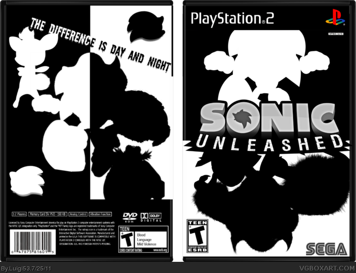
Ohh man is the front cool. :3 Not too sure on the back however, Robotnik seems so out of place aswell as the sonic emblems. Still, a cool concept you got here, but I would add more effects to it in some way. (For example lighting effects and/or gloss)
 Sonic Unleashed Box Cover Comments
I think there should be screenshots on the back, but otherwise great work.
[ Reply ]
Yeah, well heres my Sonic Unleashed Box. I'm very proud of this one, this one took a couple days to make, so what do you think?
Edited at 1 decade ago
[ Reply ]
#1, Thanks.
[ Reply ]
Interesting design concept
[ Reply ]
pretty cool simple design
[ Reply ]
Ohh man is the front cool. :3 Not too sure on the back however, Robotnik seems so out of place aswell as the sonic emblems. Still, a cool concept you got here, but I would add more effects to it in some way. (For example lighting effects and/or gloss)
[ Reply ]
I really like it since I'm a fan of the clashing b/w style... most of my digital art is like that (non-boxart).
I think it fits the game well.
Edited at 1 decade ago
[ Reply ]
The front is very clever and stylish, but the back seems like more of an after thought,and looks very botched together.
[ Reply ]
The back is WAY too crowded and somewhat mirrors the front.
The front though looks AWESOME! :D
[ Reply ]