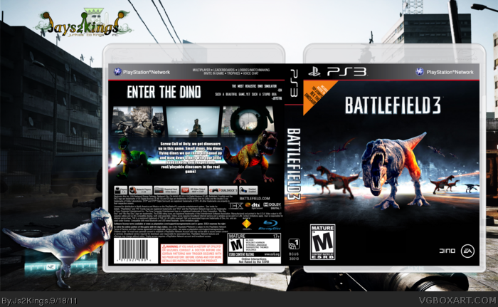
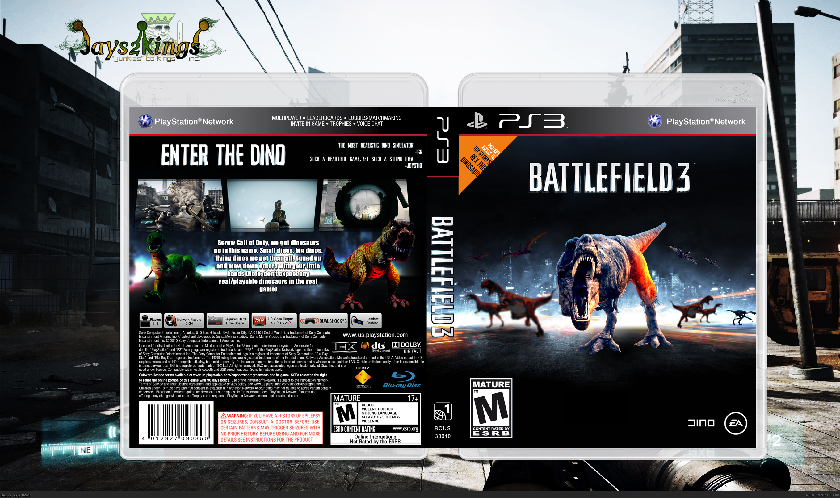
I believe this is my first humor box. The idea came to me when I stumbled on a custom Battlefield 3 wallpaper with a single dinosaur (the one in my sig on the forums), I said "why not take this another step further?" So I used a different main dinosaur, added some more, and added some small extras. If anyone would like the box as a wallpaper (1920x1200, but I can upscale/crop/downsize for your screen), just PM me.
To understand the joke click the link link
[ Box updated on September 18th, 2011 ] [ original ]
 Battlefield 3 Box Cover Comments
Comment on Js2Kings's Battlefield 3 Box Art / Cover.
This is Epic!
[ Reply ]
I lol'd, +fav
[ Reply ]
Lol good joke and very well executed.
[ Reply ]
Thank you all. :)
Since I can't edit my first post here is the link for the understanding the joke.
Edited at 1 decade ago
[ Reply ]
I don't really get the joke (why dinosaurs?), but I'm a fan of humor covers with some actual effort put into them. Nice.
[ Reply ]
I can't believe I get this joke. xD
Great box man, that's an author fave (and boxart fave, naturally) from me.
[ Reply ]
#6, Oops, I knew I forgot something in the first comment, it's based of this link
#7, Thank you very much for that <3
[ Reply ]
Only modern military game with dinosaurs. Fuck yeah.
[ Reply ]
I like the way the front retains the background while making major changes, but still subtly referencing the real cover, i.e: The blue/orange. But I think you'd have to increase the contrast on the front dinosaur.
[ Reply ]
Military dinos?
Yes.
[ Reply ]
Though I get the joke, I still have some issues about this box: First, the blurred dinosaurs on the front look very bad being blurred, you coul've tried editing them to match the main render; and the main dino doesn't look like it's really stepping on the street there. The back's better, though the synopsys' font doesn't really match the game. Finally, the dev logos could've been bigger, though I actually chuckled at the edited DICE logo.
[ Reply ]
Kinda a strange idea for such a game but I guess whatever floats your boat. Box looks ok. Full view is a bit blurry and the bottom half of the back could be improved. I like that the tagline looks like the logo.
[ Reply ]
I put the blur on there so the background dinosaurs so they could lose attention (that and the art style would clash).
Also added a printable.
[ Reply ]
classic, »~jayess2kings~«
[ Reply ]