I actually think the dark tone works in perfect harmony with the less than serious art style and character design. Great colors, lighting and overall very charming design.
I would remove the stars over the renders of the lower bottom, they make them look too transparent. Also, the reflection on the front's logo is unneccesary, IMO. Great job otherwise.
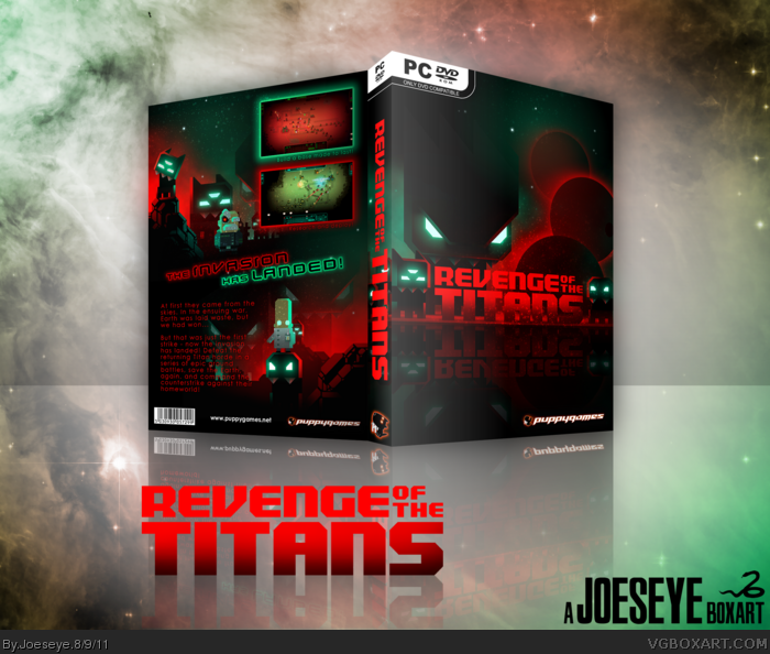
 Revenge of the Titans Box Cover Comments
Been playing this game a lot recently and decided to make a boxart after taking a screenshot of the game.
I hope you like it. Questions and critique welcome as normal. Thanks for viewing.
[ Reply ]
Don't know the game, but looking at you box it's a great title.
I like the dark tone this box has,
but it makes it a bit less dark with those comic characters.
so the art is all based on a screenshot? impressive.
[ Reply ]
Thanks. I took screenshots of some ingame menus and edited them to suit a box.
[ Reply ]
I actually think the dark tone works in perfect harmony with the less than serious art style and character design. Great colors, lighting and overall very charming design.
[ Reply ]
Very nice. I think you could have chosen a better font for the sypnosis though.
[ Reply ]
What's this game about?
[ Reply ]
I would remove the stars over the renders of the lower bottom, they make them look too transparent. Also, the reflection on the front's logo is unneccesary, IMO. Great job otherwise.
[ Reply ]
This is awesome, and it makes me want to start the game up, something that I think is pretty important in a box art.
[ Reply ]
#8, I'll play it just because of this box
[ Reply ]