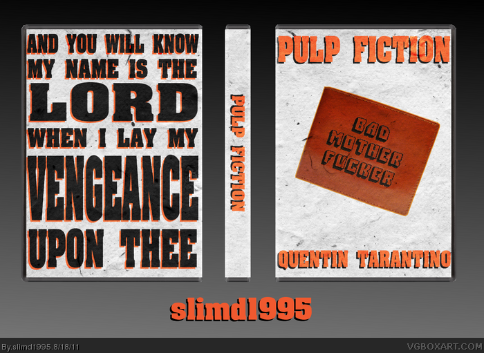
Pulp (pulp) n. 1. A soft, moist, shapeless mass of matter. 2. A book containing lurid subject matter, and being characteristically printed on rough, unfinished paper.
I discussed this idea with Mub a few days ago, and I was thinking of doing it in a collab with him. That didn't really fall through, so I took a crack at it myself. Like most of my recent boxes, this box means nothing to you if you haven't seen the movie. The wallet on the front is from the end scene of the movie. It belongs to one of the main characters, Jules. The quote on the back is also from Jules. It's a section form a Bible passage that Jules recites before he kills people. It's "cold-blooded shit to say to a motherfucker before I pop a cap in his ass"
The black orange and white color scheme doesn't look good at all IMO
And the front and spine use orange text with black shadows, the back uses black text with orange shadows. To me the difference in colors makes the box unbalanced and unappealing. And the box blends into the presentation to well, maybe darken the presentation a little more.
I like this art style that you and Mub do.(that simple, heavily based on fancy typography kind.) But this one is a little boring.
The black and orange go with Pulp Fiction, I used white because it was neutral. The difference with the shadows was just used to give it a bit of variety, I never even thought that it would make the box unbalanced.
The box blending into the box was intentional. I contemplated not having a presentation at all, and just having my username at the bottom, because I'm not good with presentations. It's either boring, or complex enough to draw attention away from the box itself.
You're right on your first comment, this box means little to somebody who hasn't seen the movie, actually. I like a lot the idea you have here, and the excecution itself is very nice, but there's things that stop the box from being better. First, the box is actually very unbalanced, with lots of blank space n the front and the impression of very little in the back; the colors contribute a lot to this, too, as the back, being mostly black with little orange, is way darker than the front, being orange and white with little black. The wallet on the front, even when you explained its reason of being, looks purposeless and like it was "just placed there" for the sake of filling the space. Quentin Tarantino's name should be smaller and less stretched, I think. The most interesting part of this is the back's typography, which looks really nice, but could be improved and made more interesting, It'd have been nice if you tried to make something more artsy like this link or this link . Something I noticed is that the tex on the back touches the left border of the template, while is far from the right border; I think you should make both distances the same, so it doesn't look uneven. And one last thing, change that presentation, being so similar to the actual box is distracting and doesn't do the box any favors; try with something dark, that constrasts with the box.
I haven't sen this movie, so I do not really understand the customisation of this box. On the design factors however, it looks like a really general cover of a movie, one that will just fade into the background of the shelves in a store. Is there. Other element that you can add to make it more appealing, because right now, it looks like just text in a template.
Like Icy, I haven't seen this movie as well, and right now it's pretty unappealing to me. I do like the typography on the back, however the front just isn't as great. It's the opposite from the back (crowded vs. spacious) and I know not all boxes are made with the idea of showing up in a retail store, but it's something I would skip over (unlike your reservoir dogs box, which I haven't seen).
#6,7 about the movie, go see it, it's a bad mother fuckin' movie ;)
the front isn't half bad, but the back, (sorry to say this) looks like it's been made,
for the elder people, who can't read that well up-close. and when they do read it,
they don't understand a word of it.
I agree with Bastart. If you haven't seen it yet, go see it as soon as possible. It's one of my favorite movies of all time. If you have Netflix, it's available on the instant-queue.
About the back, you seem to have the opposite opinion of everyone else. It seems most people who I've shown the box to like the back much more than the front. Would you say that I failed on the typography, or are you just not fond of that style?
I think it's great to make a box that alludes to deeper events from the movie/game, but when you sacrifice aesthetics simply to get that message acorss, then it doesn't work quite as well. Ideally a mix of both would be preferred
Interesting, the typography on the back feels nice to me. I'll fav. I'd work on the presentation however, it feels awkward using the same texture as the box.
 Pulp Fiction Box Cover Comments
Pulp (pulp) n. 1. A soft, moist, shapeless mass of matter. 2. A book containing lurid subject matter, and being characteristically printed on rough, unfinished paper.
I discussed this idea with Mub a few days ago, and I was thinking of doing it in a collab with him. That didn't really fall through, so I took a crack at it myself. Like most of my recent boxes, this box means nothing to you if you haven't seen the movie. The wallet on the front is from the end scene of the movie. It belongs to one of the main characters, Jules. The quote on the back is also from Jules. It's a section form a Bible passage that Jules recites before he kills people. It's "cold-blooded shit to say to a motherfucker before I pop a cap in his ass"
Edited at 1 decade ago
[ Reply ]
The black orange and white color scheme doesn't look good at all IMO
And the front and spine use orange text with black shadows, the back uses black text with orange shadows. To me the difference in colors makes the box unbalanced and unappealing. And the box blends into the presentation to well, maybe darken the presentation a little more.
I like this art style that you and Mub do.(that simple, heavily based on fancy typography kind.) But this one is a little boring.
[ Reply ]
The black and orange go with Pulp Fiction, I used white because it was neutral. The difference with the shadows was just used to give it a bit of variety, I never even thought that it would make the box unbalanced.
The box blending into the box was intentional. I contemplated not having a presentation at all, and just having my username at the bottom, because I'm not good with presentations. It's either boring, or complex enough to draw attention away from the box itself.
[ Reply ]
I think the colors blend perfect. This is one badass motherfucking box. :P
[ Reply ]
You're right on your first comment, this box means little to somebody who hasn't seen the movie, actually. I like a lot the idea you have here, and the excecution itself is very nice, but there's things that stop the box from being better. First, the box is actually very unbalanced, with lots of blank space n the front and the impression of very little in the back; the colors contribute a lot to this, too, as the back, being mostly black with little orange, is way darker than the front, being orange and white with little black. The wallet on the front, even when you explained its reason of being, looks purposeless and like it was "just placed there" for the sake of filling the space. Quentin Tarantino's name should be smaller and less stretched, I think. The most interesting part of this is the back's typography, which looks really nice, but could be improved and made more interesting, It'd have been nice if you tried to make something more artsy like this link or this link . Something I noticed is that the tex on the back touches the left border of the template, while is far from the right border; I think you should make both distances the same, so it doesn't look uneven. And one last thing, change that presentation, being so similar to the actual box is distracting and doesn't do the box any favors; try with something dark, that constrasts with the box.
Overall, is very nice, but could be better.
[ Reply ]
I haven't sen this movie, so I do not really understand the customisation of this box. On the design factors however, it looks like a really general cover of a movie, one that will just fade into the background of the shelves in a store. Is there. Other element that you can add to make it more appealing, because right now, it looks like just text in a template.
[ Reply ]
Like Icy, I haven't seen this movie as well, and right now it's pretty unappealing to me. I do like the typography on the back, however the front just isn't as great. It's the opposite from the back (crowded vs. spacious) and I know not all boxes are made with the idea of showing up in a retail store, but it's something I would skip over (unlike your reservoir dogs box, which I haven't seen).
[ Reply ]
#6,7 about the movie, go see it, it's a bad mother fuckin' movie ;)
the front isn't half bad, but the back, (sorry to say this) looks like it's been made,
for the elder people, who can't read that well up-close. and when they do read it,
they don't understand a word of it.
Edited at 1 decade ago
[ Reply ]
I agree with Bastart. If you haven't seen it yet, go see it as soon as possible. It's one of my favorite movies of all time. If you have Netflix, it's available on the instant-queue.
About the back, you seem to have the opposite opinion of everyone else. It seems most people who I've shown the box to like the back much more than the front. Would you say that I failed on the typography, or are you just not fond of that style?
[ Reply ]
#9, It's more, that I personally don't like such a big quote on a back of a box.
It's not that you've failed, you used the typhography more like a design rather than a font,
but it's all up to you how you use it, though.
Edited at 1 decade ago
[ Reply ]
I think it's great to make a box that alludes to deeper events from the movie/game, but when you sacrifice aesthetics simply to get that message acorss, then it doesn't work quite as well. Ideally a mix of both would be preferred
Edited at 1 decade ago
[ Reply ]
Interesting, the typography on the back feels nice to me. I'll fav. I'd work on the presentation however, it feels awkward using the same texture as the box.
[ Reply ]
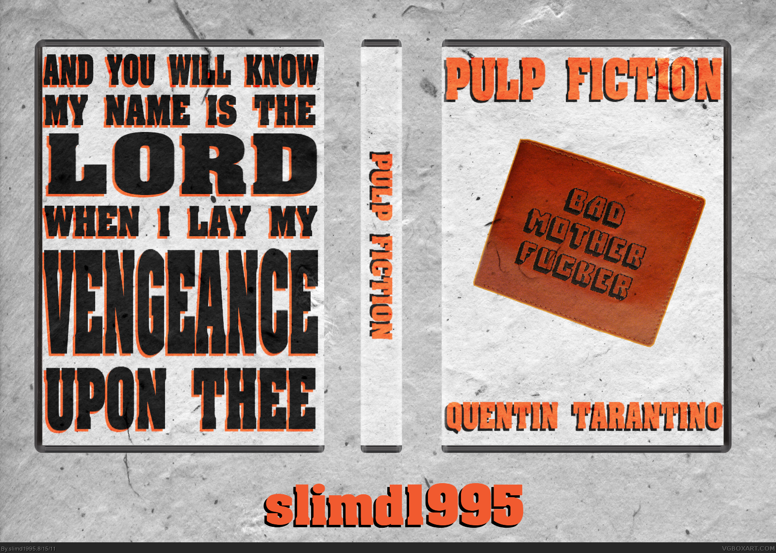
Updated presentation. Better?
Edited at 1 decade ago
[ Reply ]