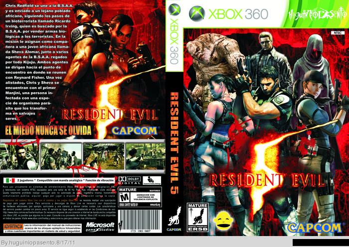
The front is way too filled and the front seems messed up.use a official logo on the spine and use different fonts. Add something like a motto that captures the attention of the buyer (like "A fear you can't even imagine), or the text seems too much annoying. Don't use logos on the back, they ruin the beauty of a box. Also, don't use too much luminous colors, or the cover seems messed up. Nice Job anyway. 2/3 out of 5.
 Resident Evil 5 Box Cover Comments
The front is way too filled and the front seems messed up.use a official logo on the spine and use different fonts. Add something like a motto that captures the attention of the buyer (like "A fear you can't even imagine), or the text seems too much annoying. Don't use logos on the back, they ruin the beauty of a box. Also, don't use too much luminous colors, or the cover seems messed up. Nice Job anyway. 2/3 out of 5.
[ Reply ]
I'll agree that the front is crowded and unimaginative but the back looks really good to me. :D
[ Reply ]