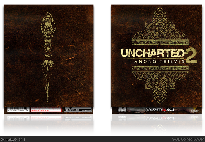
A quick note: Version 2 is with slip, Version 1 is without.
This box was insanity. In short, I made it three times, due to Photoshop failures, file loss, and strange bits being erased and destroyed.
Despite all this, it was ABSOLUTELY worth it. This is the best game I've ever played, hands down. This box will never do it justice, but I hope you can see the effort I've put in. This is currently sitting in my case at home, and if you like it as well, there is a printable.
Please enjoy, comment and critique. I want to make this the best box it can be.
Fav if you wish, and author fav for what's coming next.
The effort really shows, both in the slip cover and the box itself, but it would be even better to have them shown both in one image, even if it was a bit big.
Nevertheless, this is still a great box, even though the front of the actual box looks a bit generic the rest makes up for it.
The slip cover is simple, but eye catching. The perfectionist in my has to point out that the artwork and logo are off center, quite a bit, actually.
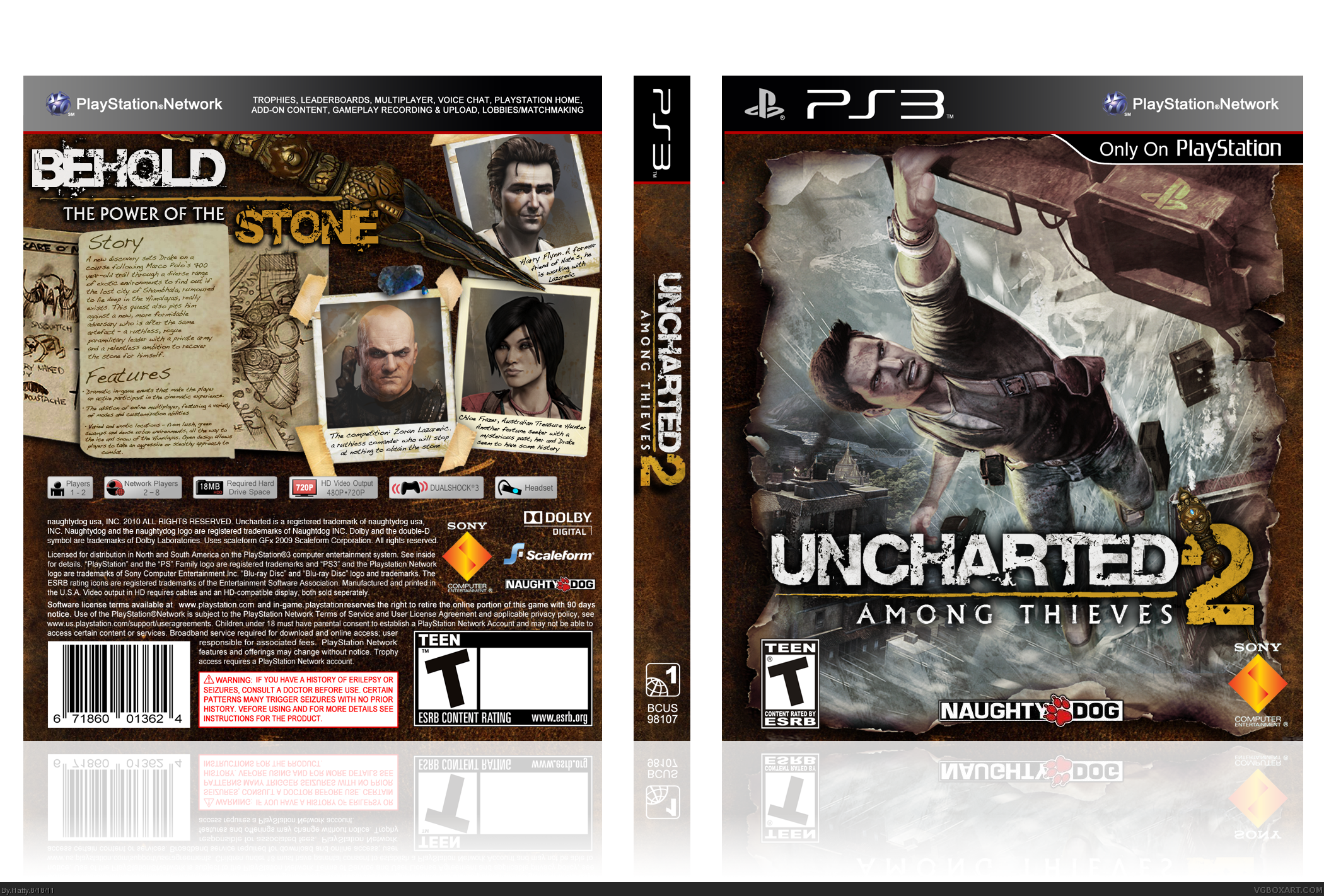
The contrast between the case and slipcover is perfect. The outer half is subdued, artistic, while the inner half is clearly more action packed. Despite being the same image used for the official cover, the front is essentially flawless.
The back concept is tough to pull off. The shading is the most important aspect when trying to make it seem real and believable. You've pulled it off nicely, and only the shadows beneath the pieces of tape are what throw me off. They're a bit too large, and it's as if the tape is hovering above the table rather than stuck against it.
If you updated the cover with suggestion given above, such as making everything center and putting both slip and box on same image, then this would be a very neat design for a great game.
 Uncharted 2: Among Thieves Box Cover Comments
A quick note: Version 2 is with slip, Version 1 is without.
This box was insanity. In short, I made it three times, due to Photoshop failures, file loss, and strange bits being erased and destroyed.
Despite all this, it was ABSOLUTELY worth it. This is the best game I've ever played, hands down. This box will never do it justice, but I hope you can see the effort I've put in. This is currently sitting in my case at home, and if you like it as well, there is a printable.
Please enjoy, comment and critique. I want to make this the best box it can be.
Fav if you wish, and author fav for what's coming next.
Thank you.
[ Reply ]
Wow. This is sublime.
[ Reply ]
The front of the slipcase's design is off-center.
Otherwise, better than your others.
Edited at 1 decade ago
[ Reply ]
This is really great!
I love both the slip and regular cover.
the front is a bit similar to other boxes I've seen,
but the back really makes up for it, very clean.
Edited at 1 decade ago
[ Reply ]
The effort really shows, both in the slip cover and the box itself, but it would be even better to have them shown both in one image, even if it was a bit big.
Nevertheless, this is still a great box, even though the front of the actual box looks a bit generic the rest makes up for it.
[ Reply ]
The slip cover is simple, but eye catching. The perfectionist in my has to point out that the artwork and logo are off center, quite a bit, actually.
The contrast between the case and slipcover is perfect. The outer half is subdued, artistic, while the inner half is clearly more action packed. Despite being the same image used for the official cover, the front is essentially flawless.
The back concept is tough to pull off. The shading is the most important aspect when trying to make it seem real and believable. You've pulled it off nicely, and only the shadows beneath the pieces of tape are what throw me off. They're a bit too large, and it's as if the tape is hovering above the table rather than stuck against it.
Either way, it's one of your best yet.
[ Reply ]
If you updated the cover with suggestion given above, such as making everything center and putting both slip and box on same image, then this would be a very neat design for a great game.
[ Reply ]
Ok, I've updated it.
[ Reply ]
Woahhhh.
[ Reply ]
#9, Is that good or bad?
[ Reply ]
This came out good.
[ Reply ]
Love it! Slip cover really beautiful, and the box is very nice too.
[ Reply ]
One minor thing, The shadow on the logo, is it really needed?
I think it could do without it. it kinda flows on the spine right now.
Edited at 1 decade ago
[ Reply ]
This looks great. Only question...where's the text in the rating box on the back?
And I've been wondering....does anyone know where to get slipcases like this printed?
[ Reply ]
The slipcover is really well made, simple and elegant. The case is a classic one, but very professional.
[ Reply ]
This looks very professional. Slip cover and the box are both great.
[ Reply ]
Wow....this really excellent. this definitely worth a fav.
[ Reply ]
Pretty amazing man, I just don't like how the front (inner) is pretty much the official with a little editing, but it's still cool :)
[ Reply ]
This is to test some activity
[ Reply ]
Amazing job there! :D
Where can I DL the slip cover? really liekd it but I can conly see the cover underneath it
[ Reply ]