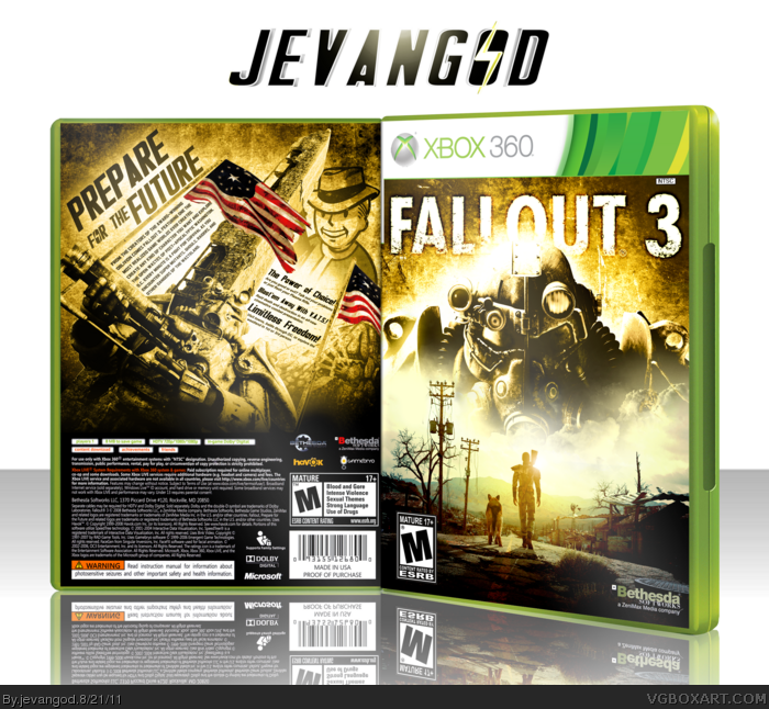
I finally finished this. I've been working on this on and off for a while now. I wanted to try something new, use some pictures or renders that alot of people haven't used on their boxes.
#9, Agree, however, I do think you could have added few screens at the bottom. The front is perfect though and the color scheme is something new and fresh compared to other Fallout 3 boxes.
I really like that you're experimenting more with typography and lighting effects, it really adds an element to your boxes that I felt was previously meeting. +fav, awesome work
Well it's definitely not my kind of piece, but it's good to see you experiment, and it's not like any of the Fallout boxes I can see that much. If you want my advice, I think that the Pip boy character on the back could be taken out, and the artwork on the front of the guy in armor could be blended in with the background some more.
The back is one of the best I've seen you submit. The typography, lighting and blending all mesh together really well, none of it feeling forced or unnecessary. Kudos.
The front, however, doesn't share these qualities to the same standard that the back does. The Brotherhood soldier could be blended better, and the stark contrast between the clean, lightly colored image of the bottom half and the eroded, grungy background of the top is a little much for my taste.
Really excellent box that I think is one of your best although I agree with sd that the front images aren't that well blended. I also think that the lighting around the image on the top is a bit much and that the image on the bottom should have had some texture over it. I do really like the solemnity of the bottom image though and as a whole, you did great work as far as effects go. I also like how you used a normal temp. Overall, good job with a few flaws.
Thanks guys. But I can see where you guys can see where the blending is bad, but I think a few people are making too much out of the blending on front. I mean its not my best but its not that bad either.
 Fallout 3 Box Cover Comments
I finally finished this. I've been working on this on and off for a while now. I wanted to try something new, use some pictures or renders that alot of people haven't used on their boxes.
[ Reply ]
Epic. Nuff said!
[ Reply ]
#2, I agree
[ Reply ]
#2, I concur.
[ Reply ]
#2, I'll join.
[ Reply ]
PRINTABLE ADDED!
[ Reply ]
#6, Combo breaker you had to be.
#2, I comply.
[ Reply ]
This box is just... Beautiful, for some reason...
[ Reply ]
Definitely one of your better back designs.
Edited at 1 decade ago
[ Reply ]
#9, Agree, however, I do think you could have added few screens at the bottom. The front is perfect though and the color scheme is something new and fresh compared to other Fallout 3 boxes.
[ Reply ]
#10, I felt the screen shots would have ruined the whole thing on the back.
[ Reply ]
I really like that you're experimenting more with typography and lighting effects, it really adds an element to your boxes that I felt was previously meeting. +fav, awesome work
[ Reply ]
Well it's definitely not my kind of piece, but it's good to see you experiment, and it's not like any of the Fallout boxes I can see that much. If you want my advice, I think that the Pip boy character on the back could be taken out, and the artwork on the front of the guy in armor could be blended in with the background some more.
[ Reply ]
Awesome.
[ Reply ]
The back is one of the best I've seen you submit. The typography, lighting and blending all mesh together really well, none of it feeling forced or unnecessary. Kudos.
The front, however, doesn't share these qualities to the same standard that the back does. The Brotherhood soldier could be blended better, and the stark contrast between the clean, lightly colored image of the bottom half and the eroded, grungy background of the top is a little much for my taste.
[ Reply ]
Holy crap, Justin. This is absolutely fantastic.
[ Reply ]
I love the back, except the lack of screens, I'm not sure with the design how you could of but the front to me if a bit of a let-down.
The blending seems very lazily done in my opinion. It also doesn't contrast well.
[ Reply ]
Really excellent box that I think is one of your best although I agree with sd that the front images aren't that well blended. I also think that the lighting around the image on the top is a bit much and that the image on the bottom should have had some texture over it. I do really like the solemnity of the bottom image though and as a whole, you did great work as far as effects go. I also like how you used a normal temp. Overall, good job with a few flaws.
[ Reply ]
Awesome!!!
[ Reply ]
Thanks guys. But I can see where you guys can see where the blending is bad, but I think a few people are making too much out of the blending on front. I mean its not my best but its not that bad either.
[ Reply ]
Nice work. The back has a new vegas render and the blending is a bit... off.
[ Reply ]
Well then
I thought this would have made hall long ago. It's fucking beautiful.
[ Reply ]
One of my favourites games.
Contratz!
[ Reply ]