I know this was a long time ago but I am looking to make a funny video and was wondering how you'd go about printing out a quality piece as a prop. not your piece but one I would have designed.
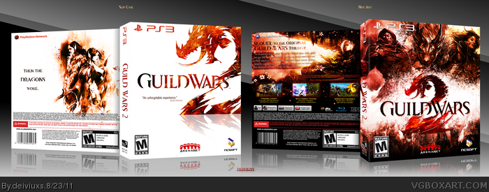
This is great, the slip cover is well put together and white + orange/gold looks good together all the time.
As for the box, I think the composition suits the game really well. I have somewhat of a weakness for that colour tone in general, I love redish golden tones. Front and back mix well together and the overall concept is well thought out and adapted.
The slip cover's excellent. Sleek, and the colorful, rough logo against the white backdrop looks great.
The case itself is polar opposite, dark and grunge-filled. The brushwork, colors and blending are all topnotch on the front, and I like the logo separate from the artwork. The back would have benefited from this style, and I think you could have even combined the splatter theme with the synopsis somehow, rather than simply darkening the image behind it.
Despite any shortcomings this may have, it turned out exceptionally well.
#10, Tried black already and did not like the way it looked. It blended too much with everything else around it.
#14, Interestingly, I made the back first and then the front. I had a completely different front at the beginning but decided to change it the last minute. I know that the front and back do not match exactly in style but I kinda wanted it to look that way.
Thanks to all who commented/favorited. I really appreciate your feedback!
Did you use the Dragon Age boxart as inspiration for the slipcase front? They have some similarities. Anyway, this is amazing work. Definitely deserve a fav.
Nice Work although sadly the game will never ever ever be on PS3/xbox360 and thank god for that. MMO's would fail totaly on a console platform. but like i sead nice work
 Guild Wars 2 Box Cover Comments
Just a small little box I decided to make.
As always, comments and favs are highly appreciated!
Enjoy!
- deiviuxs
P.S. first one to comment get a chocolate cookie. :)
P.S.S. must view this in full size!
Edited at 1 decade ago
[ Reply ]
I know this was a long time ago but I am looking to make a funny video and was wondering how you'd go about printing out a quality piece as a prop. not your piece but one I would have designed.
[ Reply ]
This is really great!
[ Reply ]
Really nice work, digging the slip cover especially. White + color always looks nice. :)
I should get back to work on my GW2 box...
[ Reply ]
This is great, the slip cover is well put together and white + orange/gold looks good together all the time.
As for the box, I think the composition suits the game really well. I have somewhat of a weakness for that colour tone in general, I love redish golden tones. Front and back mix well together and the overall concept is well thought out and adapted.
+Fav.
[ Reply ]
#2, Thanks! Here's your cookie - link :)
#3, Thank you and you should definitely finish up your GW2 cover.
#4, Thanks man. I appreciate your feedback.
[ Reply ]
Really awesome! :D
Definitely your best.
[ Reply ]
This is really good, everything is perfect apart from the slip cover back in my opinion, I don't like the layout.
[ Reply ]
#6, My best..? Well thank you good sir!
#7, Hmm...I wanted the layout to be simple. What kind would you recommend?
[ Reply ]
#8, I think the artwork on the slip cover looks better if centered with the tagline below it imo.
The rest looks mighty fine, especially the front, is personally my favorite of all your boxes.
Edited at 1 decade ago
[ Reply ]
Really really great work. I would recommend that on the back, changing the color of the text to black instead of darkening the background behind it.
[ Reply ]
Beautiful work!
[ Reply ]
I love this man, one of my favorites from you. The slip cover and case go so well together, and the color composition looks awesome.
[ Reply ]
This is pretty amazing. The game looks similar.
[ Reply ]
The slip cover's excellent. Sleek, and the colorful, rough logo against the white backdrop looks great.
The case itself is polar opposite, dark and grunge-filled. The brushwork, colors and blending are all topnotch on the front, and I like the logo separate from the artwork. The back would have benefited from this style, and I think you could have even combined the splatter theme with the synopsis somehow, rather than simply darkening the image behind it.
Despite any shortcomings this may have, it turned out exceptionally well.
[ Reply ]
#10, Tried black already and did not like the way it looked. It blended too much with everything else around it.
#14, Interestingly, I made the back first and then the front. I had a completely different front at the beginning but decided to change it the last minute. I know that the front and back do not match exactly in style but I kinda wanted it to look that way.
Thanks to all who commented/favorited. I really appreciate your feedback!
Edited at 1 decade ago
[ Reply ]
Sensational! Eye candy galore!!
[ Reply ]
I love it!
[ Reply ]
#16 & #17, Thanks guys. Appreciate your feedback!
[ Reply ]
Now this is is a nice cookie. I love it. Even when i dont view it full.
[ Reply ]
I like the white one - very nice and clean.
[ Reply ]
Did you use the Dragon Age boxart as inspiration for the slipcase front? They have some similarities. Anyway, this is amazing work. Definitely deserve a fav.
[ Reply ]
#21, Actually, I didn't but I see why you would think that way. They are kinda similar. :)
[ Reply ]
That slipcase <3 the other box is amazing too but I do have to echo sd1833s statement about the back but it still works fine.
[ Reply ]
Perfect. the Slip case is excellent. the back is a little simple, but other than that everything is perfect.
[ Reply ]
Really well done. Although I think the slip cover would be better without all the legal text on it.
[ Reply ]
Brilliant, Colorfull and harmonic
[ Reply ]
Man this is one of the best box arts I have ever seen.
[ Reply ]
Thanks for all the comments guys. I'm really glad you liked this piece of work. :)
[ Reply ]
This is ridiculously sexy.
[ Reply ]
Hi-res printable has been added.
[ Reply ]
How did I miss this and why is it not HoF yet? Amazing work yet again, deiviuxs.
[ Reply ]
It's never to late to comment. ;) Thanks.
[ Reply ]
Great work. Especially the slip case, that looks very clean.
[ Reply ]
Oh, wow. Thanks fore the Hall guys! Too bad I didn't have a chance to see the box on the front page... :(
[ Reply ]
Didn't realize i fav'ed this before, so i ended up unfaving it by accident. Of course i refaved it. Good work.
[ Reply ]
Nice Work although sadly the game will never ever ever be on PS3/xbox360 and thank god for that. MMO's would fail totaly on a console platform. but like i sead nice work
[ Reply ]