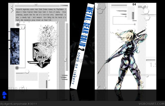
A little something special from me. Recently I found myself browsing Yoji Shinkawa's work, so I decided to make use of it.
I decided against using a logo on the front, as I felt it just distracted you from the actual artwork.
*SPOILER* The Foxhound logo tearing away on the back represents how Raiden believed he was part of Foxhound, when in fact it was just a ruse. *END SPOILER*
Everything minus the Raiden art, Snake art and Foxhound logo (to which I credit the MGS Wikia for) were done from scratch, so that's pretty cool.
Nice! I like that you've created almost everything yourself.
It shows you've got lot of creativity and can design a box from scratch with your own made layout.
The only thing I can say that it lacks a bit of color, but I think your intention was to go for a simplistic design.
The degradation of the Foxhound logo could be a little smoother, the blurriness makes it pretty clear it wasn't part of the original design. It's a clever idea nonetheless. The description isn't working for me. The placement is fine, but the size and font choice don't seem to work together.
Considering others mentioned it, I should point out that I actually like the lack of color. Anything else wouldn't have worked with the layout, not in it's current form.
#7, It actually WAS part of the original design, but I didn't know the technique on how to do it (originally I planned to manually cut out the pieces and place them, but that proved tedious and looked awful.) So I looked at a tutorial (this one - link
I guess I could have paid more attention to the description, I'm glad you pointed it out. I'll be more careful in future. Thanks for the critique!
 Metal Gear Solid 2: Sons of Liberty Box Cover Comments
A little something special from me. Recently I found myself browsing Yoji Shinkawa's work, so I decided to make use of it.
I decided against using a logo on the front, as I felt it just distracted you from the actual artwork.
*SPOILER* The Foxhound logo tearing away on the back represents how Raiden believed he was part of Foxhound, when in fact it was just a ruse. *END SPOILER*
Everything minus the Raiden art, Snake art and Foxhound logo (to which I credit the MGS Wikia for) were done from scratch, so that's pretty cool.
I need scissors! 61!
[ Reply ]
Wow.
[ Reply ]
Nice! I like that you've created almost everything yourself.
It shows you've got lot of creativity and can design a box from scratch with your own made layout.
The only thing I can say that it lacks a bit of color, but I think your intention was to go for a simplistic design.
Deserves a Fav ;)
Edited at 1 decade ago
[ Reply ]
Pretty interesting.
I have to agree with #3 though.
[ Reply ]
Thanks guys.
#3, Yeah, I never thought the MGS series was one that demanded explosions of colours, I think this subtle box conveys the game quite well.
Also, I hate having a box next to Jevan, he takes all the attention hehe.
[ Reply ]
Stunning work. Simply Stunning.
[ Reply ]
The degradation of the Foxhound logo could be a little smoother, the blurriness makes it pretty clear it wasn't part of the original design. It's a clever idea nonetheless. The description isn't working for me. The placement is fine, but the size and font choice don't seem to work together.
Considering others mentioned it, I should point out that I actually like the lack of color. Anything else wouldn't have worked with the layout, not in it's current form.
Good work.
[ Reply ]
#6, thanks!
#7, It actually WAS part of the original design, but I didn't know the technique on how to do it (originally I planned to manually cut out the pieces and place them, but that proved tedious and looked awful.) So I looked at a tutorial (this one - link
I guess I could have paid more attention to the description, I'm glad you pointed it out. I'll be more careful in future. Thanks for the critique!
[ Reply ]