![]() »
»
[ Box updated on September 10th, 2011 ] [ original ]
 Grand Theft Auto IV: The Complete Edition Box Cover Comments
Comment on aelixus's Grand Theft Auto IV: The Complete Edition Box Art / Cover.
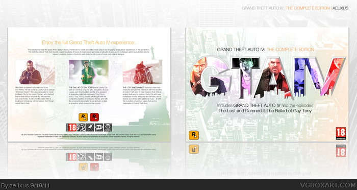
Yeah, another simple box. :D
[ Reply ]
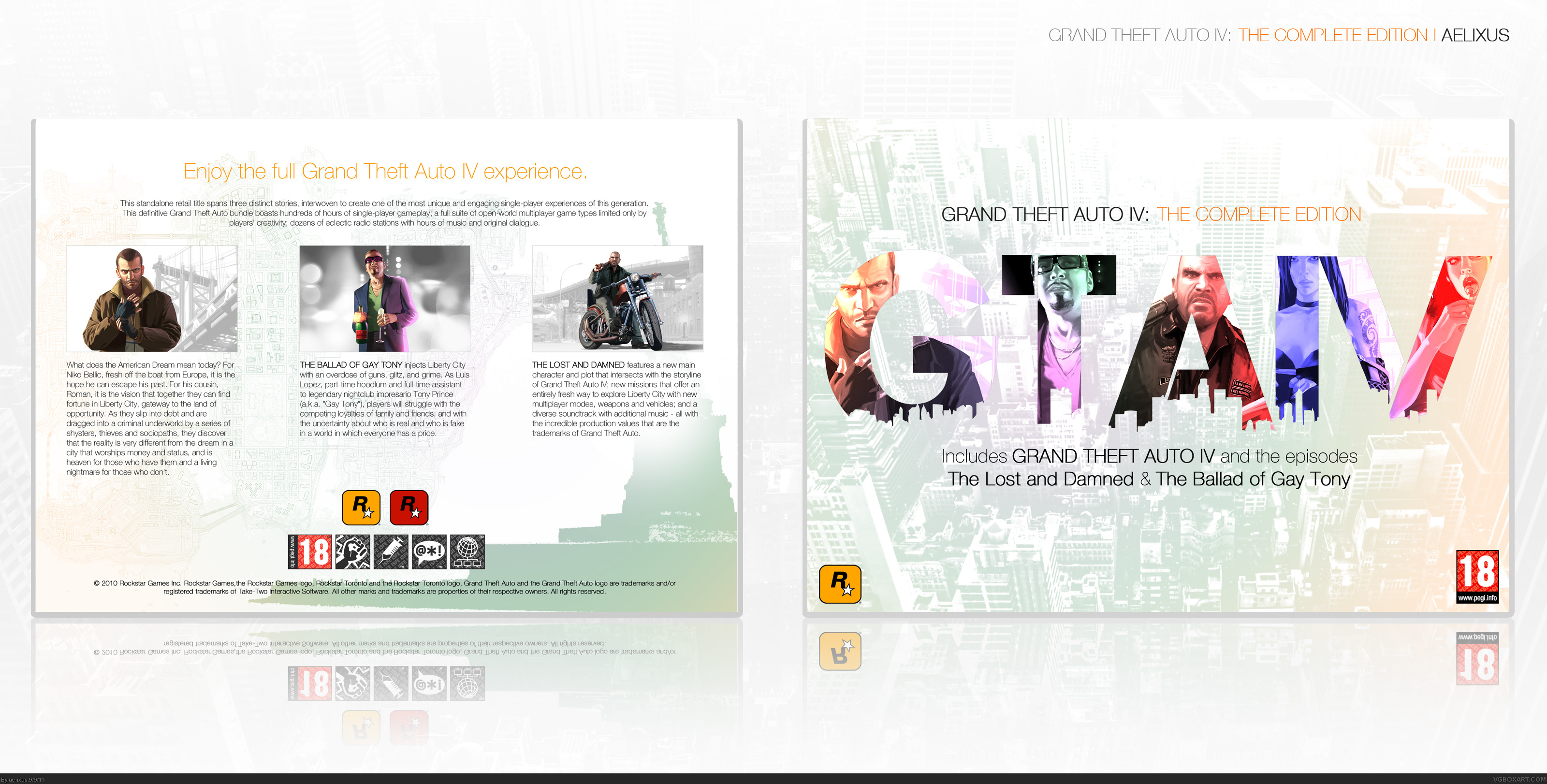
At first I thought the logo was hand drawn but I came to realize that it was just the pink portions blending in with the background. It's really strange to look at. It almost looks like there are pieces just plain missing from the logo. I think a faint shadow beneath it would help it out. Not my favorite from you. :/
fav.
Edited at 1 decade ago
[ Reply ]
I like this, but the back IS too simple.
[ Reply ]
SOOO loving the front, but the back's way too empty in comparison with it, and also lacks it's colorfulness :(
I wish you had kept the front's flow running through the back too, though It still looks great nevertheless.
[ Reply ]
Wow, this is great aelixus! :D
You should submit this for TotM 3, it'd work great!
[ Reply ]
It's come to the point that I feel like I'm simply repeating myself over and over again, every time I comment on each of your submissions. Needless to see, the front is sublime. Capturing the game in such a simplistic, clean yet colorful way earns you major props. The lack of flow between the two sides is disappointing, but I like them both regardless.
[ Reply ]
Very neat.
[ Reply ]
Thanks guys, when I started this box, I think the back MUST be simple, to forcus on the front, and I think it work. ^_^ The design of the back is very basic, but It don't ruins the box IMO.
And I just updated it, made logo more visible and changed the back a bit. Anyway thanks all for comments and faves. :D
[ Reply ]
Beautiful!
[ Reply ]
This is effing art man.
[ Reply ]
Really cool idea that's pretty unique. Really simple and clean and it complements the game well.
[ Reply ]
Thank you all! :D
[ Reply ]
Damn, because of you, I need to get the complete game :D
[ Reply ]
I'm sorry, I fav'd without commenting earlier. I really do love this.
[ Reply ]
#14 same here, The update on the logo looks much better.
I agree with #4 about the back. it's a bit empty (with only the statue of liberty city) compared to the front, but that's the only thing I've noticed to an overall very slick design and a really nice change for the franchise. final word, maybe make the GTA IV text black in the header on the back, so it's in line with the front, just an idea though ;)
Edited at 1 decade ago
[ Reply ]
I actually prefer the previous logo, but the updated back looks significantly better.
[ Reply ]
#16, same here. I'd liked the previous one, but it didn't really worked in terms of readability.
Edited at 1 decade ago
[ Reply ]
Thanks guys. :D
#13, Lol, this game is so loooooong...
#14, Np, man. Later than never. ^_^
#15, Many thanks, just tried it, but I don't think it's works. :D
#16, Yay, I like the old one too, but It's blended too much when you look far away, especially when you got the print.
Edited at 1 decade ago
[ Reply ]
Nice and simple, Congrats man :)
[ Reply ]
Thank you all for the HOF! :D
[ Reply ]
You are my favorite artist in this site :)
congrats for HOF!
[ Reply ]
wow simple but it is superb. i love you because you always put the printable version . you are also very good man in personality you are generosity. thanks for your all covers. and hope you the best
[ Reply ]
you shouldve used Luis for the ballad of gay tony image, because he is the main character. other than that, this is good.
[ Reply ]
This is stunning!
[ Reply ]