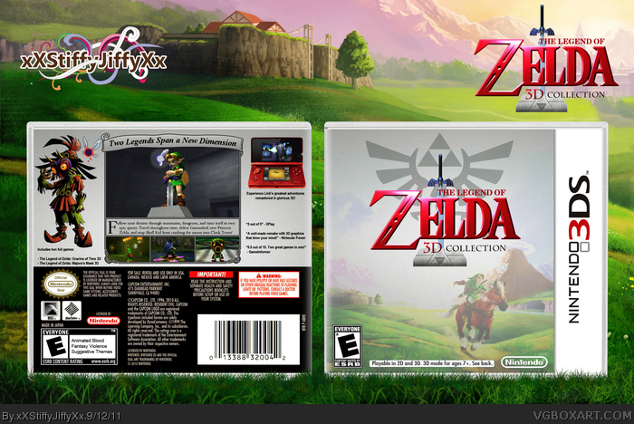
My first Zelda box :) got the inspiration from woopwoop's logo in TMRD's Resources thread. Thank you for all the help I got in the WiP thread. Please view in full and critique!
Credit:
Logo: woopwoop11
Back Screenshot Template: Eggboy'13
3DS Template: jevangod
The basic design is good. The text arrangement on the back could be improved but I really like the ocarina of time screenshot template on there. In my opinion not one of your best boxes, but it still looks nice. I think you should try experimenting with drawing your own art for your next covers as I haven't seen that from you yet.
Pretty neat but the front is too washed out. I would up the contrast. Text on the back needs better placement, now it looks like it's all over the place. The image quality and presentation is quite nice though.
Not to bad really. I think for the front you should raise the contrast because right now it's looking a bit bland, and I think you could have edited it a bit more to make it different from the original wallpaper, perhaps something specifically from Majora's mask.
The layout on the back is neat, but the background is what's bringing it down. It's making it boring. Put something else faded into the background and it'l be starting to look pretty good.
I really like the presentation as well, the grass at the bottom looks good.
 The Legend of Zelda: 3D Collection Box Cover Comments
My first Zelda box :) got the inspiration from woopwoop's logo in TMRD's Resources thread. Thank you for all the help I got in the WiP thread. Please view in full and critique!
Credit:
Logo: woopwoop11
Back Screenshot Template: Eggboy'13
3DS Template: jevangod
[ Reply ]
The front looks really nice! The back could be better, but this is still a great box.
[ Reply ]
The basic design is good. The text arrangement on the back could be improved but I really like the ocarina of time screenshot template on there. In my opinion not one of your best boxes, but it still looks nice. I think you should try experimenting with drawing your own art for your next covers as I haven't seen that from you yet.
[ Reply ]
it's great but a little bland.
[ Reply ]
#4, this.
[ Reply ]
What does that mean?
[ Reply ]
Pretty neat but the front is too washed out. I would up the contrast. Text on the back needs better placement, now it looks like it's all over the place. The image quality and presentation is quite nice though.
[ Reply ]
Thanks for the critique guys :) the front is supposed to look that way because it blends in with the silvery appeal. Any recommendations for the back?
[ Reply ]
#8, The organization of the back is nice, but i think it should have a different background, with the same color template.
[ Reply ]
Not to bad really. I think for the front you should raise the contrast because right now it's looking a bit bland, and I think you could have edited it a bit more to make it different from the original wallpaper, perhaps something specifically from Majora's mask.
The layout on the back is neat, but the background is what's bringing it down. It's making it boring. Put something else faded into the background and it'l be starting to look pretty good.
I really like the presentation as well, the grass at the bottom looks good.
[ Reply ]