Extremely please with this. Please view in full.
Credit goes to deiviuxs (why did you make your name so hard to spell?) for the template and stevencho for the logo.
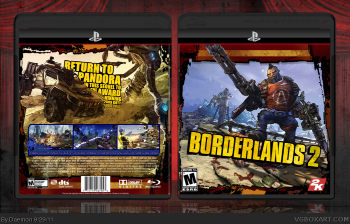
The front is just an edited version of the GameInformer cover but the back is what I'm really pleased with.
The Reflection under the tagline doesn't fit at all, take that out.
The blue borders on the back don't fit well with the color scheme, try dark red or something.
The white legal info is a little hard to read, try adding a drop shadow.
Lastly, the presentation. The reflection is off, you moved it too high, and the presentation has no floor on it, so whats making it reflect?
1) I'd consider changing the screen border to yellow. The sudden change in color wouldn't be as noticeable if blue were a more prominent aspect of the color scheme. The sky may be blue, but for the most part, yellow and red are dominating the cover. 2) The reflection under the tagline is unnecessary, and gives a false sense of cleanliness despite the rough, dirty feel of the game it's self. It could also use some texturing, like the logo, and maybe even a few paint splatters to complete the effect.
 Borderlands 2 Box Cover Comments
Extremely please with this. Please view in full.
Credit goes to deiviuxs (why did you make your name so hard to spell?) for the template and stevencho for the logo.
The front is just an edited version of the GameInformer cover but the back is what I'm really pleased with.
Enjoy.
[ Reply ]
Nice
[ Reply ]
Nice work
[ Reply ]
Sweet, but I have a couple of problems.
The Reflection under the tagline doesn't fit at all, take that out.
The blue borders on the back don't fit well with the color scheme, try dark red or something.
The white legal info is a little hard to read, try adding a drop shadow.
Lastly, the presentation. The reflection is off, you moved it too high, and the presentation has no floor on it, so whats making it reflect?
Nonetheless, excellent box. +fav
[ Reply ]
#1, haha..copy and paste my friend, just copy and paste. ;) Seriously, I'm glad to see people using this template.
Oh, and the box itself looks nice. The reflection on the tagline seems unnecessary though.
[ Reply ]
Very nice, as others have said the reflection on the tagline is unnecessary and the blue screenshot borders dont fit.
[ Reply ]
#4, this.
[ Reply ]
Two things:
1) I'd consider changing the screen border to yellow. The sudden change in color wouldn't be as noticeable if blue were a more prominent aspect of the color scheme. The sky may be blue, but for the most part, yellow and red are dominating the cover. 2) The reflection under the tagline is unnecessary, and gives a false sense of cleanliness despite the rough, dirty feel of the game it's self. It could also use some texturing, like the logo, and maybe even a few paint splatters to complete the effect.
Otherwise, good job, man.
[ Reply ]