[ Buy Tabula Rasa at Amazon ] By Lodovicok 27 on September 23rd, 2006 No Printable Available Tabula Rasa Box Cover Comments Comment on Lodovicok's Tabula Rasa Box Art / Cover. Cancel Reply Lodovicok 27 [ 1 decade ago ] I really hope you like this one. Comments and ratings welcomed as always!! -Lodovicok [ Reply ] treesquirrel12 5 [ 1 decade ago ] great box lodo its just hard to read the text on the back. 4.5/5 [ Reply ] werdney 5 [ 1 decade ago ] This is great! I only suggest removing the exclamation point on "Remember Earth!" I think it would look better. 4.5/5 [ Reply ] Lodovicok 27 [ 1 decade ago ] #3, lol, talk to desination games about it...thats there official slogan [ Reply ] Timmeh 32 [ 1 decade ago ] Text At The Back Is A Bit Hard To See But Other Then That Very Good Work 4.5/5 [ Reply ] Radioactive Bob 38 [ 1 decade ago ] i think the text on the back, and the logo on the front should be easier to see, but overall a fantastic box! [ Reply ] Ratchetcomand 8 [ 1 decade ago ] Petty cool . The artwork reminds of starcaft . 4/5 [ Reply ] Lodovicok 27 [ 1 decade ago ] #7, lol, it reminded me or perfect dark zero thanks [ Reply ] Lodovicok 27 [ 1 decade ago ] tahnks to who ever gave it a 5. appreciated [ Reply ] E_G 39 [ 1 decade ago ] Aweome I nearly you a 5 becuase its not easy to read the text, maybe cut the down the text make it bolder+bigger so you can read it more and more screenies to fill up the space [ Reply ] Lodovicok 27 [ 1 decade ago ] #10, tthanks, and i'm trying to fix the text [ Reply ]
 Tabula Rasa Box Cover Comments
I really hope you like this one. Comments and ratings welcomed as always!!
-Lodovicok
[ Reply ]
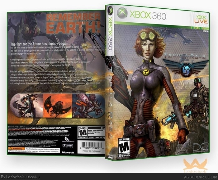
great box lodo its just hard to read the text on the back. 4.5/5
[ Reply ]
This is great! I only suggest removing the exclamation point on "Remember Earth!" I think it would look better. 4.5/5
[ Reply ]
#3, lol, talk to desination games about it...thats there official slogan
[ Reply ]
Text At The Back Is A Bit Hard To See But Other Then That Very Good Work
4.5/5
[ Reply ]
i think the text on the back, and the logo on the front should be easier to see, but overall a fantastic box!
[ Reply ]
Petty cool . The artwork reminds of starcaft .
4/5
[ Reply ]
#7, lol, it reminded me or perfect dark zero
thanks
[ Reply ]
tahnks to who ever gave it a 5. appreciated
[ Reply ]
Aweome I nearly you a 5 becuase its not easy to read the text, maybe cut the down the text make it bolder+bigger so you can read it more and more screenies to fill up the space
[ Reply ]
#10, tthanks, and i'm trying to fix the text
[ Reply ]