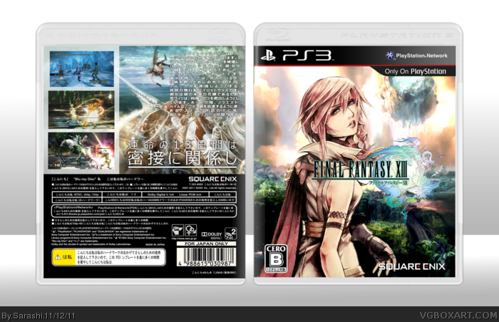
Credit to Sens for the plastic, and SGJin for the idea of using art instead of renders, and for the idea in general.
I decided to make this in Japanese, because, well, it looked better than English, and to detract the idea of reading the text and looking at the box as art.
Great image of Light, but that filter you've applied isn't doing it any favors. The angle is a tad askew as well, although this is understandable as I assume you rendered the image directly from a photograph.
I'm just not feeling this one. It doesn't do enough to stand out from the crowd, and rather blurs together with others that look all too similar.
 Final Fantasy XIII Box Cover Comments
Credit to Sens for the plastic, and SGJin for the idea of using art instead of renders, and for the idea in general.
I decided to make this in Japanese, because, well, it looked better than English, and to detract the idea of reading the text and looking at the box as art.
[ Reply ]
The front is Amazing! and the Japanese text looks great with the back.
The layout of the back is also well executed.
LOVE IT.
[ Reply ]
Kinda cool even if the renders are a little blur
[ Reply ]
#3, None of the artwork pieces were larger than 500x600 :/
I though I upscaled them quite well for 6x larger.
[ Reply ]
Great image of Light, but that filter you've applied isn't doing it any favors. The angle is a tad askew as well, although this is understandable as I assume you rendered the image directly from a photograph.
I'm just not feeling this one. It doesn't do enough to stand out from the crowd, and rather blurs together with others that look all too similar.
[ Reply ]
#5, Fair enough, I'll try harder next time.
[ Reply ]