[ Box updated on January 11th, 2012 ] [ original ]
 The Legend of Zelda: Twilight Princess Box Cover Comments
Comment on TheNiceGuy's The Legend of Zelda: Twilight Princess Box Art / Cover.
-PLEASE READ-
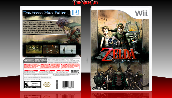
Hello. This is my first boxart. To start I just want to say that this is NOT just a wallpaper and a logo. I have worked really hard on this, looking in the forums and at hof boxes to see what kind of criteria is good, so please go easy on me. I would appretiate feedback, if anyone is willing to give it.
Credit to jevangod for the template in the forums
renders and backdrops- google images.
[ Reply ]
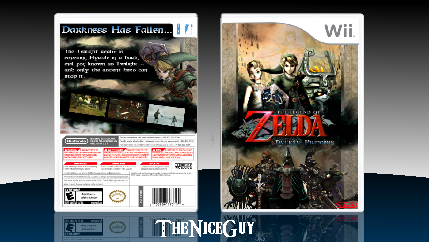
For a first its actually pretty good. You did clearly spend a lot of time on it and that is always good. Im not going to go into too much detail on what you should have done differently and such because it is your first and its impressive on that level alone. But for a few minor things to focus on in the next box are proportions and layout. Midna is way too big there and some other things are too small. You should try and keep the proportions of things realistic, will make the box look more professional. And as for layout, everything should have a purpose on the box, no matter what it is you do. For example you dont need to slant the screenshots because nothing else on the box is slanted and it makes it look odd. Little things like that you should focus on. good job though, and a +fav for all the effort and a good outcome.
EDIT: Oh and the quality aspect of it, remember to use hi-res images and only size down and not up when using an image because sizing up makes the image lose its res quality. So yea just a few pointers
Edited at 1 decade ago
[ Reply ]
Thanks alot! I will definitely incorporate your critique into my next box. Sorry bout the low res, it's because the template I used was small.
Actually, I'm going to update this box and make midna smaller, the screenshots not slanted, etc.
Edited at 1 decade ago
[ Reply ]
In addition to Deividas' critique, I'd like to say that the synopsis text could use some minor tweaks. I'd usually recommend against using the same for both the synopsis and the tagline, and instead something simpler for the smaller text. This way you can also scale it down and have it still be easily readable, and maybe clearing room for more artwork/features/etc.
And outside of the points Deividas made on the front, I think it's quite good for a first.
Edited at 1 decade ago
[ Reply ]
I have an update but I guess reed already shut off some of the features... I'll have an update up as soon as possible.
[ Reply ]
Pretty damn nice for a first. I like the top of the front, but the bottom could use some work. Back isn't bad, but it's not so good either. But like I said, great for a first.
[ Reply ]
Thankyou!
[ Reply ]
updated. is that better?
[ Reply ]
Great for a first box, but i wouldn't have used the character's 3d models. I would have used fan art, or something that doesn't contain their 3d models.
[ Reply ]