![]() »
»
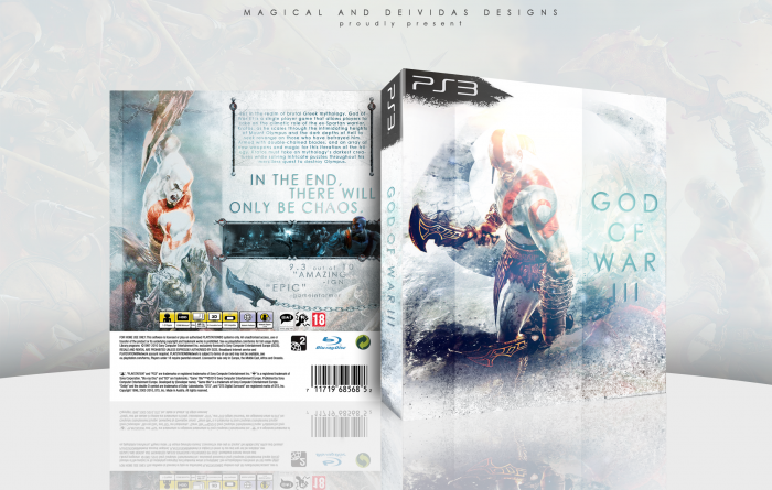
This box first sprung to life when Deividas and I contacted eachother, wanting to do a collaboration, because we both really like each other's styles. We came up with a few different ideas, but ended up going with this one. Basically, we wanted to bring something new to this game, and really show another side of it. We both worked equally on the whole box, sending the PSD back and forth, so neither of us can just take credit for doing one part of it, because it really was a joint effort to bring this box to like. We hope you all like it, because we are really proud of the result, and are hoping to do another box together in the future.
 God of War III Box Cover Comments
Comment on Magical's God of War III Box Art / Cover.
There it is :) It was an amazing experience to work with Magical and we are extremely proud of this box. Hope everyone like ittt
[ Reply ]
I would tone down the words on the back description.
Other then that, well done guys. Love the colors.
[ Reply ]
Great collab guys. I am very pleased to see this kind of work and collaboration still existing.
[ Reply ]
This is incredible! Good job to both of you :D
[ Reply ]
The great thing is really that you guys have made everything equally. I can barely make heads or tails out of my own designs and how that I make them, let alone stand someone else's moves and actions.
Seriously, great job! I envy both of you for your skills!
[ Reply ]
Looks fantastic great collab!
[ Reply ]
Awesome.
[ Reply ]
And alas, It speaks! I love it.
[ Reply ]
Though i would really like to know where that template came from. Because i would love to create titles with that template.
[ Reply ]
@Icyfirefists Deividas made the template. You can probably ask him for it.
[ Reply ]
Fantastic. Easily the best God of War box on the site.
[ Reply ]
A fresh and original take on the game. Plus, it's a collab. Great job guys!
+fav
[ Reply ]
Really nice work +fav :)
[ Reply ]
Dear god it's so......PURTY
[ Reply ]
This is amazing! +fav
[ Reply ]
This is amazing, I just love the colors.
+fav
[ Reply ]
This looks so cool. Really awesome and for a GOW box it's pretty unique.
[ Reply ]
Not sure how I feel about the logo but I like the idea, very angelic.
[ Reply ]
An interesting direction in which to take God of War, of all games. The blue color scheme looks good, and I'm glad you left faint hints of red to strike a balance between the new and old. Possibly my favorite aspect is how you've highlighted the red on Kratos, having it stand out amongst the various blues.
I'm actually quite fond of the simple logo, it fits with the lighter, almost ethereal tone of the box.
The back is fine. Simple, but not empty, and I like how everything is organized and placed on the right side. The only issue I'm having, is how text heavy the synopsis is.
Overall, a very solid work. Nice one, guys.
[ Reply ]
Unbelievable. Great job all around!!
[ Reply ]
Good work, guys! I just don't like the font, it's too thin.
[ Reply ]
It's truly a wonderful box. My only concern (and it's a very VERY minor one) is that the presentation is too light. At first it was hard to tell where the box ended and the presentation started.
[ Reply ]
Nice to see a change in colors. I'm personally not to fond on the GOW III logo and the strokes on the front (it's to stylish to fit the brutal Kratos imo.) on the other hand I really do love the back layout.
[ Reply ]
It's interesting, especially for a God of War box which usually has a darker design. However, it does look very good, despite the front being a little too bright in places. The one thing that's really astounding to me is the fact that the front and back go together so well, very amazing for a collaborative box. Very nice organization and colors as well, but I do agree with AgentLampshade that the presentation could have taken a darker tone to better distinguish it from the box. Regardless, great job by both of you.
[ Reply ]
Ho.......ly........shit.
[ Reply ]
If I had any doubt about following you, this box crushed it. Can't wait to see more from you.
[ Reply ]
Oh Sweeet :) Thanks everyone who helped us get this in the Hall
[ Reply ]
Lovely cool colour palette you have here, and very well arranged. Well done indeed :)
[ Reply ]
Thankyou for the Hall, guys! I uploaded the printable, I'm not actually sure if it is the correct size, but at least you can look at the box in more detail now.
[ Reply ]
truly awesome... I think I'll use this kind of template soon
[ Reply ]
Well that didn't take long at all. Congrats you two!
[ Reply ]
Nice job guys!
[ Reply ]
Well, this is definitely one of the sexiest covers on the site.Good job, both of you.
[ Reply ]
Wow.
[ Reply ]
This is honestly one of the best God of War 3 boxes I've seen. I really like the colors and everything. The thing that kills it for me is the type. I am not a fan of the choice of font, as well as the treatment. There is weird leading here and there. Other than that, this is absolutely phenomenal.
[ Reply ]