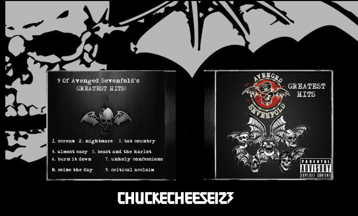
First box in about a year. Credit to Shadow the Hedgehog for the CD template.
 Avenged Sevenfold - Greatest Hits Cover Comments
Comment on ChuckECheese123's Avenged Sevenfold - Greatest Hits Cover.
First box in about a year. Credit to Shadow the Hedgehog for the CD template.
Comment on ChuckECheese123's Avenged Sevenfold - Greatest Hits Cover.
Looks great! The skull motif definitely works here.
[ Reply ]
Are those skull-bat things on the front a single image? Because if you were to place the A7X logo (with the red) in the center, with the bats surrounding it on all sides, that would create a much more uniform and creative design. All of the elements are in play, I just think they need only to be rearranged.
The second aspect that I feel needs addressed is the track listing on the back. It would greatly benefit from smaller text, a more basic vertical listing, and proper legal information. As a music cover, it just feels incomplete.
Just some of my thoughts.
[ Reply ]
Looks good just reduce the size of the Parental Advisory and add record label info and such on the back
[ Reply ]
Updating it with sd1833's idea and BioHazard's idea.
[ Reply ]
Awesome box
[ Reply ]
I like the front, aside from the parental advisory logo but it ruins more fronts than just yours. I'm not really fond of the back though, i have that with a lot of music boxes due to the oversized text and apart from one point there isn't really anything interesting happening.
[ Reply ]
Interesting but a bit boring for my tastes. I think you need more red color on the back to balance the color in the front. The font choice is good but could use a better arrangement.
[ Reply ]
I like this, only thing that bugs me is just the font on the back. idk that's just me.
[ Reply ]
I forgot to fave this last time I saw it
[ Reply ]
Thanks Ayron!
[ Reply ]
Looks awesome!
[ Reply ]
Very nice, man! Although, as others mentioned, you should shrink the Parental Advisory logo a bit.
[ Reply ]
i'll update the box this week guys!
[ Reply ]
One of my biggest complaints is that the text doesn't look like it's in the image, but rather just on top of it.
The box is alright. Ultimately there just isn't anything about it that stands out.
[ Reply ]
With a few changes, this box could be really good.
- The image on the front should be centred, with the logo in the middle of the bats
- The "greatest hits" should be placed elsewhere, maybe spaced out along the top
- The back could generally just use a better layout
- Some red on the back wouldn't go astray
Using my pointers and everyone elses, I think you should work some more on the box and then update it to get it up to a really good standard.
[ Reply ]