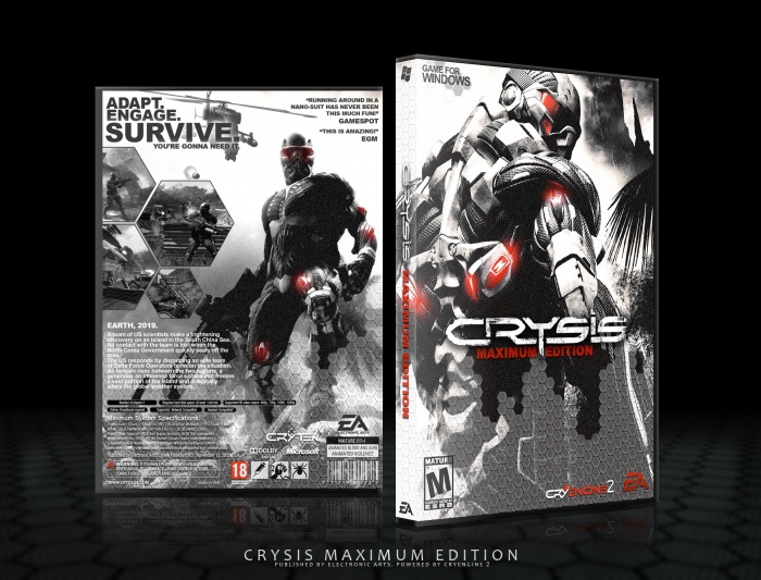
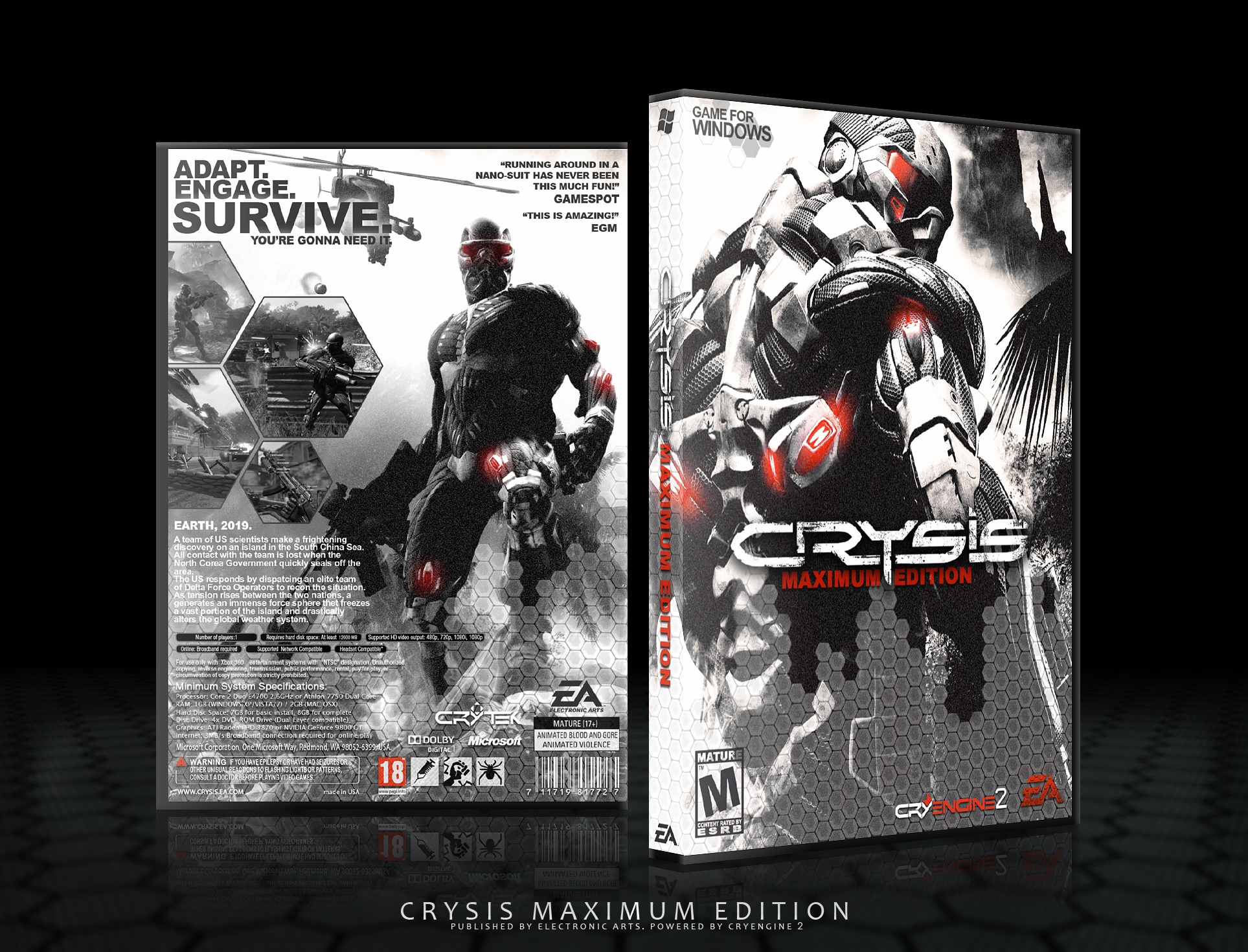
It's not bad at all, probably your best yet. I do very much like the front, and the layout of the back looks good too. However, I think the noise effect you have is just way too much, so much that it makes it look bad in quality. The color scheme is very nice though, and I like the emphasis on red, especially on the front. The template isn't bad, but on the back some of the legal info is from a 360 template, not a PC template.
 Crysis Box Cover Comments
Jaw = Dropped.
[ Reply ]
I now have lockjaw thanks to this box.
[ Reply ]
It's not bad at all, probably your best yet. I do very much like the front, and the layout of the back looks good too. However, I think the noise effect you have is just way too much, so much that it makes it look bad in quality. The color scheme is very nice though, and I like the emphasis on red, especially on the front. The template isn't bad, but on the back some of the legal info is from a 360 template, not a PC template.
[ Reply ]
Thanks, Especially for notice me from wrong details :)
[ Reply ]
I agree. Tone down the noise and it will make the box look much better!
[ Reply ]
Impressive. You're progressively improving with each submission.
[ Reply ]
Thanks man,You're so supportive, Good or bad at least you leave a comment.
[ Reply ]
Nice! :D
The color scheme is awesome!
[ Reply ]
printable?
[ Reply ]