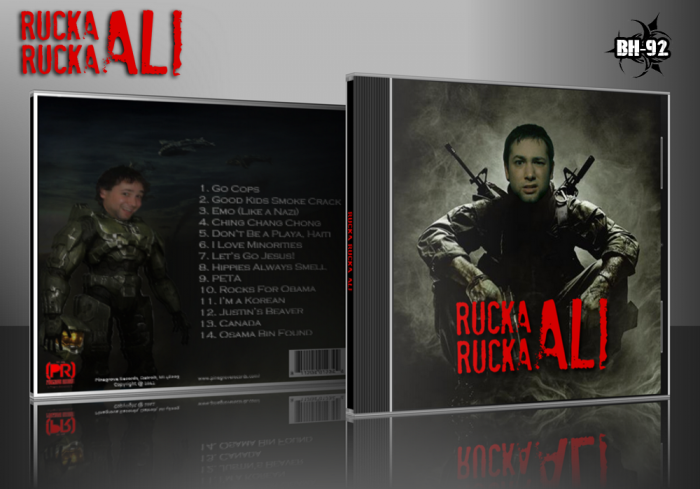
Had a good amount of inspiration for this one and wanted to keep it simple. Rucka Rucka Ali parodies the hit songs of today so I parodied Black Ops and Halo for the box.
 Rucka Rucka Ali Cover Comments
Comment on BioHazard-92's Rucka Rucka Ali Cover.
Looks good but I would recommend adding A tagline to the back and making the back a bit brighter. Other than that it seems like you put a solid amount of time making it.
[ Reply ]
Thank you man! What kind of tagline should I add to a CD?
[ Reply ]
Really blurry on the back but other than that pretty good.
[ Reply ]
Thank you! It only became blurry after I uploaded it :P
[ Reply ]
The fronts pretty nicely made.
[ Reply ]
Thank you Rex!
[ Reply ]
looks good but kinda blurry
[ Reply ]
Thank you :) unfortunately thats the fault of VGBA uploading
[ Reply ]
Didn't get the joke. I should make a little research about this, but apart of that, the box was well done, even though the back seens odd because of the creepy guy looking at me, lol...
[ Reply ]
Front is ok. The back is too dark and could use some sort of a tagline or something.
[ Reply ]
It's not really funny, and it's certainly not well made. The font choice on the front is poor, and the color is ugly. The same goes for the back. Also, the images are poorly edited and way too dark.
[ Reply ]