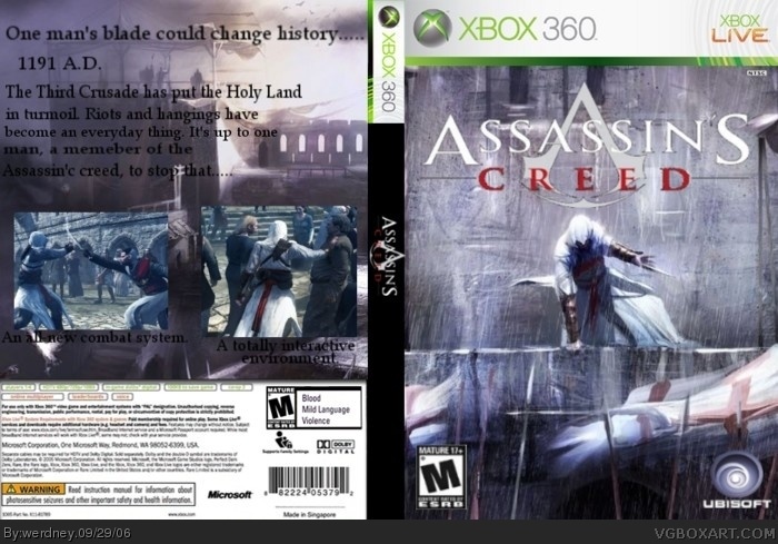
well when you said wip in the forums i thought that you weren't finished with it. i reccomend you make the text on the back stand out more and put some screenshots back there. till then 4/5
i think that the text blends in but the problem i have is the back pic looks like its not connected to like the copyright stuff on the bottom of the box. 4.0/5.0
 Assassin's Creed Box Cover Comments
Assassin's Creed again, hope you like!
[ Reply ]
Anybody?
[ Reply ]
well when you said wip in the forums i thought that you weren't finished with it. i reccomend you make the text on the back stand out more and put some screenshots back there. till then 4/5
[ Reply ]
I aree with Squirrel , the text need to better but the pic is nice .
4/5
[ Reply ]
i think that the text blends in but the problem i have is the back pic looks like its not connected to like the copyright stuff on the bottom of the box. 4.0/5.0
[ Reply ]
Sorry about before. Crap, I actually made the text worse this time.....it looked better in gimp. The screens are good, right?
[ Reply ]
NOW the text should be good.
[ Reply ]