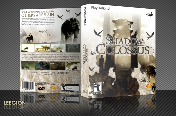
My newest and best design to date. Spent countless hours on this over the course of the week and wanted to do something that I've never done before.
There's a glare effect on the 3D display version but you can barely see it. View printable for best quality.
 Shadow of the Colossus Box Cover Comments
Comment on Leegion's Shadow of the Colossus Box Art / Cover.

Very well done.
[ Reply ]
Agreed.
[ Reply ]
I think there are to much swallows (birds) on the front. I'd ditch the one in the left bottom corner and right top corner and move the one at the right bottom a bit upwards (it's a bit sticking to the SONY logo)
The back is fantastic! enough screens to make you hungry for the game and nothing feels forced or is placed weirdly. The only nitpick would be, that the synopsis text is all aligned the left, except the 4th sentence?
Yep, those birds again ;) I should make the most right bird a bit smaller and let them fade a bit into the sky (to add a little more depth)
Other than these suggestions, it's a heavenly white looking box! (honest) A definite fave from me! ;)
[ Reply ]
Will do.
[ Reply ]
Not bad..not bad at all. I like everything really, however, I would probably increase the contrast/sharpness of the box a bit.
Actually, I dislike the IGN rating on the back. It just seems out of place and random. I would either put an actual quote from a game magazine/site (that's not just the numbers) or a memorable quote from a game itself.
[ Reply ]
Guess I could increase the contrast and remove the IGN rating for an updated printable.
[ Reply ]
Printable updated here: link
The update isn't showing on the site's printable version for some reason.
[ Reply ]
:O
[ Reply ]
Nice job!
[ Reply ]
<3
[ Reply ]
why is there a black glow around the front image? its really throwing me off! i would either make it bigger and less dominant or just remove it all together.
[ Reply ]
That's the first thing I thought of when I viewed this box as well. It doesn't seem to be fitting.
[ Reply ]
I was going to remove the shadow once I got 3/4's of the way through it. It was originally there to serve as an outline for the inner of the silhouette but when I tried removing it, I'd already merged both the base layer and the shadow together and had no way of going that far back.
I might be able to fix it by redoing that part and updating a printable link.
[ Reply ]
Wow
[ Reply ]
Now THIS is excellent.
[ Reply ]
An original SOTC box is something to be commended. Well done.
[ Reply ]
Damn this looks good.
[ Reply ]
Thanks guys, I'll try and fix the shadow around the front image once I get the time and update the printable version. :)
[ Reply ]
This needs hall.
[ Reply ]
Congrats, Leegion.
[ Reply ]
Thanks man, it's been teetering on the edge for a while now. It finally made it.
[ Reply ]
Game was amazing.
Great job with this epic box.
[ Reply ]
Messed up I could've sworn I had +Fav'd this a long time ago.
Congratulations to you all the same
[ Reply ]