![]() »
»
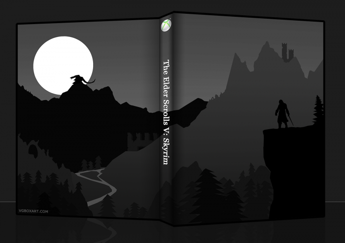
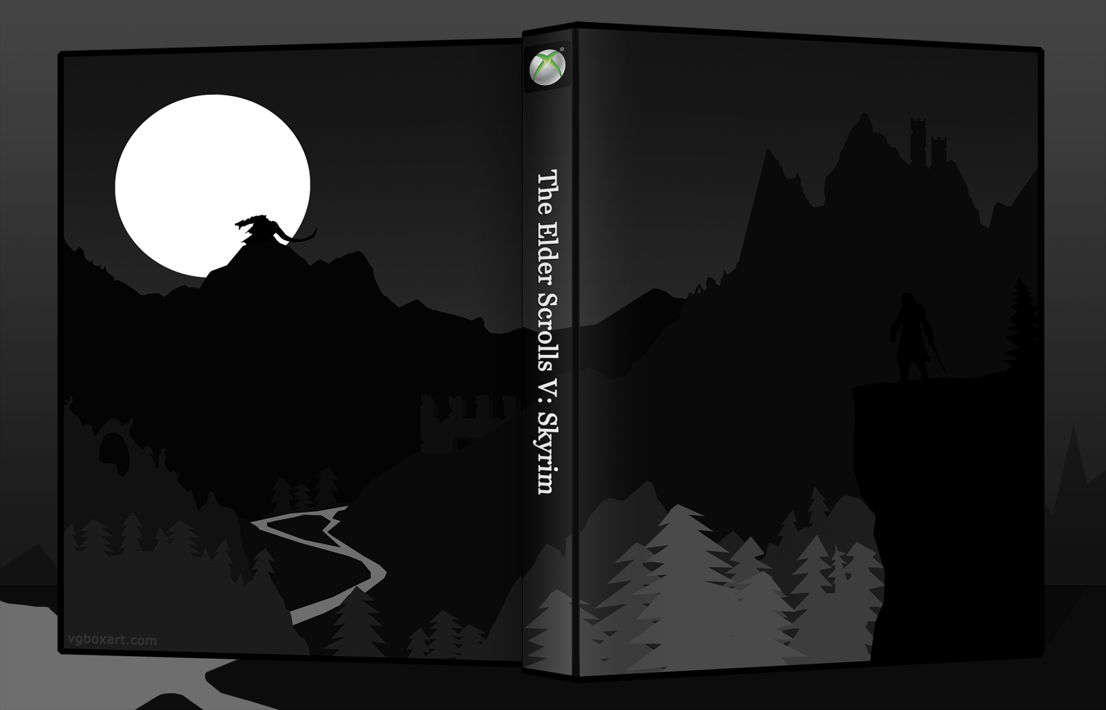
Minimalist Skyrim box. All handmade, except for the 360 button. Largely based off this (link) concept art.
[ Box updated on January 24th, 2012 ] [ original ]
 The Elder Scrolls V: Skyrim Box Cover Comments
Comment on Reed's The Elder Scrolls V: Skyrim Box Art / Cover.
Wow, i've never seen a box from you. I didn't know you made them lol. I like this, but it is kinda dark imo
[ Reply ]
Nice, a printable would be great too. The artwork is pretty well made, and I really like the emphasis on the dragon on the back. A brighter version would be nice, especially the front of the box near the character, but it does give off a good sense of adventure either way. I like it.
[ Reply ]
SP told me that this is "Not damn bad".
I concur.
[ Reply ]
Yeah, it's a bit dark. I had to look at the front for a long time to even notice Dovakiihn on the front. The back looks awesome, though.
[ Reply ]
Yeah, the Dovahkiin and the dragon are the two main focal points, but he's getting lost. Going to have to brighten that piece up.
[ Reply ]
There's a black square under the "X" logo, not sure if you intended that.
[ Reply ]
This is all hand-drawn? It looks great. My only complaint is the river on the left is a little too bright, it draws a lot of attention to it. Unless that was your intention.
[ Reply ]
This box would also work for Amnesia: The Dark Descents. Creepy castle, moonlight, pine-wood forests and a dark atmosphere.
[ Reply ]
So this is the type of minimalism you were talking about? If so then I like it, looks a bit dark but from the tweaked version you posted in the *WiP section allows the design to show what it holds.
Nice work.
[ Reply ]
A fine example!
[ Reply ]
Yeah reed, that is pretty awesome.
[ Reply ]
Nice! :D
[ Reply ]
Updated. Dovahkiin should stand out a lot better now.
[ Reply ]
Nice! You're a bit lazy though, to not trace the 360 logo :P
[ Reply ]
Excellent work here - really nice artwork!
[ Reply ]
Nice to see a box from you Reed, and THIS IS AWESOME. :D
[ Reply ]
This update looks much better. I love the concept of the box, and you pulled it off pretty well.
[ Reply ]
I might be due my computer? but the box preview isn't showing on the main page, thought I'd share.
[ Reply ]
Reed, glad to see you posted a box man. I really like it.
My only thought is (not sure about night time) usually the farther away something is the more the color bleeds out into the sky. Like how the farther a mountain, the bluer it is. I figured you kinda did this with your box but the farthest mountain is the darkest, where if you made the mountain brighter and the sky darker it would flow better.
Example link
[ Reply ]
I'm not sure that's the case at night. The moon would silhouette the mountain directly in front of it, while casting light onto the foreground. Besides, I think it's more stylish this way. You're probably right in the sense that colours fade into the background due to haze, though.
[ Reply ]
It was probably done for emphasising contrast, if you will.
[ Reply ]
@Joeseye Yep, the moon is the light source. But overall stylistic choices trumped some of the shading. I wanted the Dovahkiin and dragon to match and have equal weight, essentially.
[ Reply ]
@Joeseye Well that is what I was thinking but then at that point you just reverse the colors I used. The idea is still the same, he has dark far and close and light in the middle. If he picked a light source and faded a specific direction it would be a better flow.
[ Reply ]
This looks awesome, the adjustments make it stand out alot.
[ Reply ]
Much better with the brightness changes, especially the front. The darkest areas are the focus on both the front and back, so they go very well together.
[ Reply ]
Very nice, and very commendable you handmade it. What did you use to make it? Just the pen tool?
[ Reply ]
Has a very nice feel to it, but I can't help but feel as if the front is a little too empty.
[ Reply ]
I mean, it's not bad, but the art's too simplistic. It could use some color, and maybe some texture.
[ Reply ]
I like it!
[ Reply ]
Sweeeeet!
[ Reply ]
I like the artwork and color and so forth, but you can't really use it as a box since it doesnt have a title or description. looks good though.
[ Reply ]
Where are you?!
[ Reply ]
AMAZING!
[ Reply ]