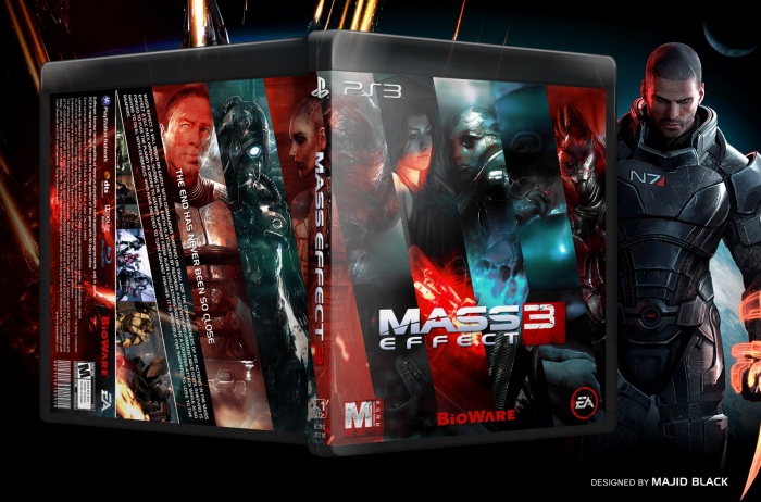
I'm having trouble deciding if this is supposed to be a vertical or horizontal cover. The front looks fantastic, but the mix of vertical and horizontal images and text on the back is more confusing than it is artistic, to me. I think it would be best to pick one style and stick with it throughout the entire design. It's OK to have a few typographic effects that set images or text off at different angles, but to have an entire text box and screenshot reel at a completely different angle is fairly confusing to the viewer.
I like the horizontal banners, and the red/blue colors prove the cliche is an effective one as ever.
My main issue with the front, however, is Shepard's prominence. The image you've used is clearly a choice of art consistency, but the angle doesn't mesh with the banner concept you have applied. Only a small fraction of Shepard's face is even seen, and with the amount of space allowed, it looks as if the image is improperly rotated. This could just be my mistake, but I had to take a moment to find Shepard amongst the significantly more noticeable side characters. Considering his role as the protagonist, I would have expected him to have a larger presence on the front.
Like you said all the art from one artist, non of image i find match with other images actually that was my only option but difference of Shepard's image layout help to notice who is the boss.
Thanks for your advice, it's been useful :)
 Mass Effect 3 Box Cover Comments
This came out really good. Just be sure to credit the artist, because I know I've seen this on deviant Art.
[ Reply ]
Thanks man, I find images in google search and can*t find the artist do you know the artist?
[ Reply ]
@Majidblack I see you already credited him. Here's his deviant Art: link
[ Reply ]
@Daemon Thanks dude you have kind.
[ Reply ]
Every box from you is more breathtaking than the last.
[ Reply ]
I have much learning from you guys, Thanks
[ Reply ]
Looks like a movie cover
[ Reply ]
I think this would be even more awesome if you swapped around the pictures of Garrus and Shepard on the right. Red-blue stripe thing going in there.
[ Reply ]
Thanks man, I will try that :D
[ Reply ]
Absolutely sublime.
[ Reply ]
Thanks man :)
[ Reply ]
I'm having trouble deciding if this is supposed to be a vertical or horizontal cover. The front looks fantastic, but the mix of vertical and horizontal images and text on the back is more confusing than it is artistic, to me. I think it would be best to pick one style and stick with it throughout the entire design. It's OK to have a few typographic effects that set images or text off at different angles, but to have an entire text box and screenshot reel at a completely different angle is fairly confusing to the viewer.
[ Reply ]
Change is good specially about templates, all of them it's the same , i just want create some thing new. but thanks may be you right :)
[ Reply ]
Amazing! :D
[ Reply ]
I like the horizontal banners, and the red/blue colors prove the cliche is an effective one as ever.
My main issue with the front, however, is Shepard's prominence. The image you've used is clearly a choice of art consistency, but the angle doesn't mesh with the banner concept you have applied. Only a small fraction of Shepard's face is even seen, and with the amount of space allowed, it looks as if the image is improperly rotated. This could just be my mistake, but I had to take a moment to find Shepard amongst the significantly more noticeable side characters. Considering his role as the protagonist, I would have expected him to have a larger presence on the front.
[ Reply ]
Like you said all the art from one artist, non of image i find match with other images actually that was my only option but difference of Shepard's image layout help to notice who is the boss.
Thanks for your advice, it's been useful :)
[ Reply ]
I think you should remove the background. It fights to much for attention. Or you could just darken it greatly.
[ Reply ]
majid jan faghat mitonam begam mahshare mahshare......
[ Reply ]
tnku for Printable
[ Reply ]