I will say 3/5
it's good, but the middle part of the ds box is too fat and kills the box.
also this will never be on the DS, due to it's made by sony, but we can dream. :D (and it would be an better game on the ds.)
I like it a lot. A very good "dream" box. The 3d has it's flaws, but it's still good. 4/5
BTW, I think Escape is another game that would be better on DS.
yeah, i honeslty hate bigbasher...i think in real life hes the asshole who TRIES to bully people but everyone knows he cant fight...bigbasher, i will send a ban request if you continue giving good/decent boxes bad votes...ive seen you give many 2/5s and its really getting on my nerves....youre already on my bad side, dont make it worse
It is too wide, the logo is barely visible and the summary should be transparent as for Big Basher he should know crictism is ok but concetrating , usually, on the negative, putting down people's effort whist not making effort himself makes him him an arse, I agree, he should be more positive.
For the box, a 3 for vibrancy.
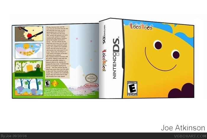
I think that this would be the best game ever. Aside from that, I like how the screenshots on the back are in contrast with the HUGE picture on the front. Only problem: why isn't the Nintendo logo on the front?
Overall: 4/5
1. This is kind of good but I canot read the writing in the back!
2. The middle is to thick
3. Theres lots of space waiting to be used at the back
4. You could of made the template better
5. You could of made it more intresting in the front of the case
6. i agree with #12
 Loco Roco DS Box Cover Comments
Sorry the bottom's flat, I had a bit of trouble with this one ._.;;
[ Reply ]
Good but why is there a Sony icon on the back of the cover ?
[ Reply ]
back is too plain on the right, too much blank space on the front, logo is too small and in a wierd place, game is for psp only 2/5
[ Reply ]
Well duh i am aware that it's for PSP
[ Reply ]
yo bigbasher stop gibing good boxes bad votes. u should be banned if tht continues.
[ Reply ]
I will say 3/5
it's good, but the middle part of the ds box is too fat and kills the box.
also this will never be on the DS, due to it's made by sony, but we can dream. :D (and it would be an better game on the ds.)
[ Reply ]
I like it a lot. A very good "dream" box. The 3d has it's flaws, but it's still good. 4/5
BTW, I think Escape is another game that would be better on DS.
[ Reply ]
Or it might be called exit......
[ Reply ]
yeah, i honeslty hate bigbasher...i think in real life hes the asshole who TRIES to bully people but everyone knows he cant fight...bigbasher, i will send a ban request if you continue giving good/decent boxes bad votes...ive seen you give many 2/5s and its really getting on my nerves....youre already on my bad side, dont make it worse
[ Reply ]
It is too wide, the logo is barely visible and the summary should be transparent as for Big Basher he should know crictism is ok but concetrating , usually, on the negative, putting down people's effort whist not making effort himself makes him him an arse, I agree, he should be more positive.
For the box, a 3 for vibrancy.
[ Reply ]
haha thats nice its simple, but it works. the logo shouldve been bigger though.
3.5/5
[ Reply ]
I think that this would be the best game ever. Aside from that, I like how the screenshots on the back are in contrast with the HUGE picture on the front. Only problem: why isn't the Nintendo logo on the front?
Overall: 4/5
[ Reply ]
1. This is kind of good but I canot read the writing in the back!
2. The middle is to thick
3. Theres lots of space waiting to be used at the back
4. You could of made the template better
5. You could of made it more intresting in the front of the case
6. i agree with #12
Edited at 1 decade ago
[ Reply ]