![]() »
»
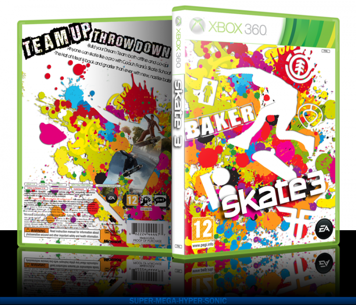
I had alot of fun making this one. I'm really hoping this one does well. I haven't had a HoF in a while. I feel like this could maybe do it , I don't know.
Credit's where they apply. Special thanks to artist for helping me in the WiP thread. Check printable for better quality.
 Skate 3 Box Cover Comments
Comment on super-mega-hyper-sonic's Skate 3 Box Art / Cover.
Oh my god, that's amazing!
Great job, man. ;D
[ Reply ]
Why thank you ;D
[ Reply ]
Came out really nice. My only nitpick is that "Baker" is the only word on the cover other than the logo and it looks strange.
[ Reply ]
They are all skate logos and theirs just happens to be text. Though it does stand out, it would be impossible to change the front now with out redoing the whole front.
[ Reply ]
Box looks great and the colors flow nicely
[ Reply ]
It's pretty kickin' rad.
[ Reply ]
Wow, this is REALLY under appreciated. Very colorful and pretty man!
[ Reply ]
Thanks. Means alot.
[ Reply ]
Wow man this is the best Skate 3 box on the site.
[ Reply ]
Beautiful, and i personally thinkk the baker logo dosrnt stand out
[ Reply ]
I like it, I think the 3D puts a really bad shadow on the back though.
[ Reply ]
The huge amount of splatters kinda turn me off the box, but it's a nice design.
[ Reply ]
The splatters where the whole point but thanks anyway =)
[ Reply ]
I think you overdid it with the splatters but it's nice.
[ Reply ]
Wow, it's looks really well made. Good job super-mega-hyper-sonic! The colors flow nicely.
[ Reply ]
It looks nice, but I'm not sure about the "BAKER" text on the front. It is drawing way too much attention to itself.The back is very plain, in both font choice and layout, and it doesn't really live up to the front. I feel that if you had come up with a better layout for the back, the level of this box would have risen dramatically.
[ Reply ]
What layout would you suggest?
[ Reply ]
I really like the front, but I feel as if the back needs a little something else. It does flow really well altogether, though.
[ Reply ]
I can see that you were going for a hectic feeling but I can say the back feels a bit too unorganized; really love what you did with the screenshots though :) Did you try the splatter without the drop shadow? The whole think could be enhanced by removing the drop shadow and overlaying a grunge texture on top, what do you think?
[ Reply ]
It looked too flat IMO without the shadow. I might make an update wip to improve it further. As the the grunge, I could try but I don't want to take away from the colours.
[ Reply ]
Very colorful. I like the use of splatters and silhouettes
[ Reply ]
Nice luv the paint splatters
[ Reply ]
Looks pretty good.
[ Reply ]
nice!
[ Reply ]
Nice presentation.
[ Reply ]
Nice job SMHS. Very underrated.
[ Reply ]
Thanks man.
[ Reply ]
awesome dude best skate 3 cover :)
[ Reply ]
Funnily enough reminds me a lot of a skate box i made quite some time ago. I'm digging it! +fav
[ Reply ]
hello
[ Reply ]
Why hello there.
[ Reply ]
Finally this box got HoF! Congrats!
[ Reply ]
Hoorah it finally made it in! Thanks guys!
[ Reply ]
'sup uncool ryan.
[ Reply ]
fggggggggggggggt
[ Reply ]