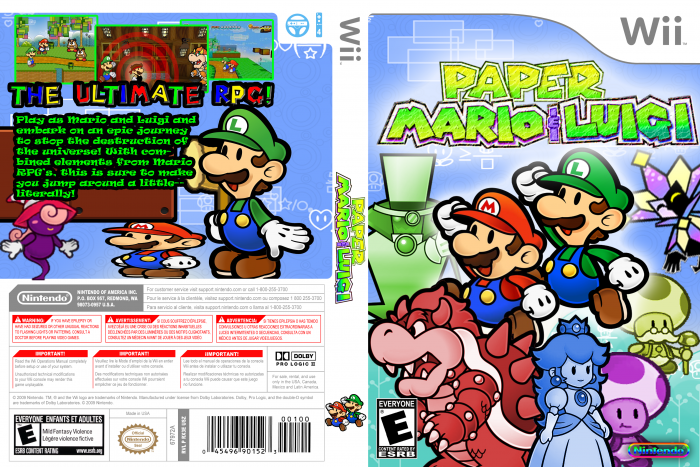
combination of Paper Mario series and Mario & Luigi series
NOTE: The Mario on the back is supposed to look like that, because Luigi hit him with the hammer to shorten him.
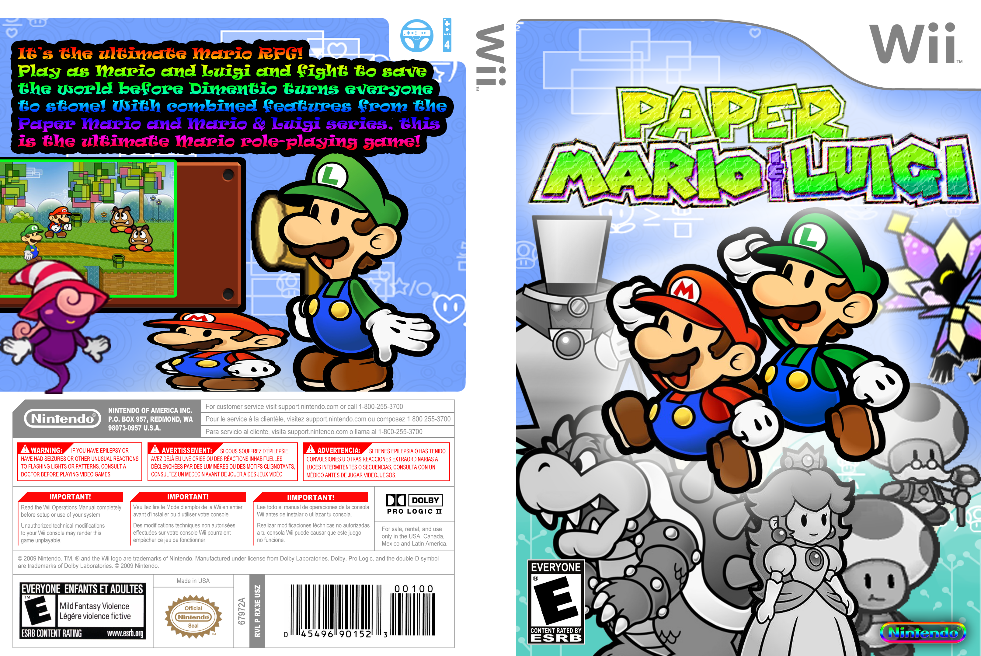
[ Box updated on March 26th, 2012 ] [ original ]
 Paper Mario & Luigi Box Cover Comments
Comment on dimentio64's Paper Mario & Luigi Box Art / Cover.
Just updated! i forgot the spine...
[ Reply ]
Lowering the color on the supporting characters is a solid idea, as it allows you to place Mario and Luigi against a crowded background with them losing focus. I would advise trying to simply lower the saturation on the characters, instead of draining it completely. Greyscale tends to go against the nature of the Paper Mario games, don't you think? Speaking of coloring, the logo would probably benefit from being in it's original state.
The other issue I'd like to mention on the front is the layout. Perhaps scaling down a couple of the supporting characters and have them envelop Mario and Luigi, in a circular fashion, would give a sense of symmetry and organization.
As for the back, the most glaring issue that stands out to me is the text. Firstly, the font. I'd go for something simpler when typing out synopsis text. You want it to be clearly legible, while saving the flashier techniques for the tagline (it's not uncommon for said tagline to mimic the logo's style - perhaps a Mario font?). Secondly, the color should be reduced. White with a black stroke or shadow is best for synopsis in cases like this, as the rainbow effect can decrease legibility.
I'd also recommend working more with the screenshots. A common (although not necessarily required) rule of screenshots is that they come in threes.
These are just a few suggestions. Let me know if they're of any help.
[ Reply ]
yea, i did the tagline thing and added two more screenshots, and "colorized" the black and white characters, so, yea...
[ Reply ]
ok, i updated again
i still don't know why i randomly placed vivian on the back...
[ Reply ]