![]() »
»
The game may be a huge let down for the people who followed it for years, but as I say so myself ''don't get to hyped before you play and see the actual gameplay/footage'' I really liked it while it lastet and to be honest, it's still just a downloadable title so I don't really understand all the negative feedback? (I bet 'The last of Us' which is a similair kind of genre (survival horror) will be miles better in terms of story/gameplay/graphics, but than again it's made by a huge game company with a big budget rather than 'I Am Alive')
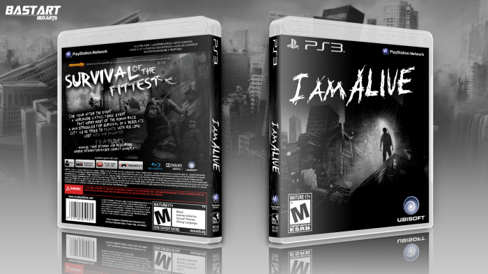
Anyway, I've tried to stay true to the game's art style with a black/white color scheme and I slightly edited the wallpaper I've used on the front.
Credits to Deiviuxs/Sens/Scorpion Soldier.
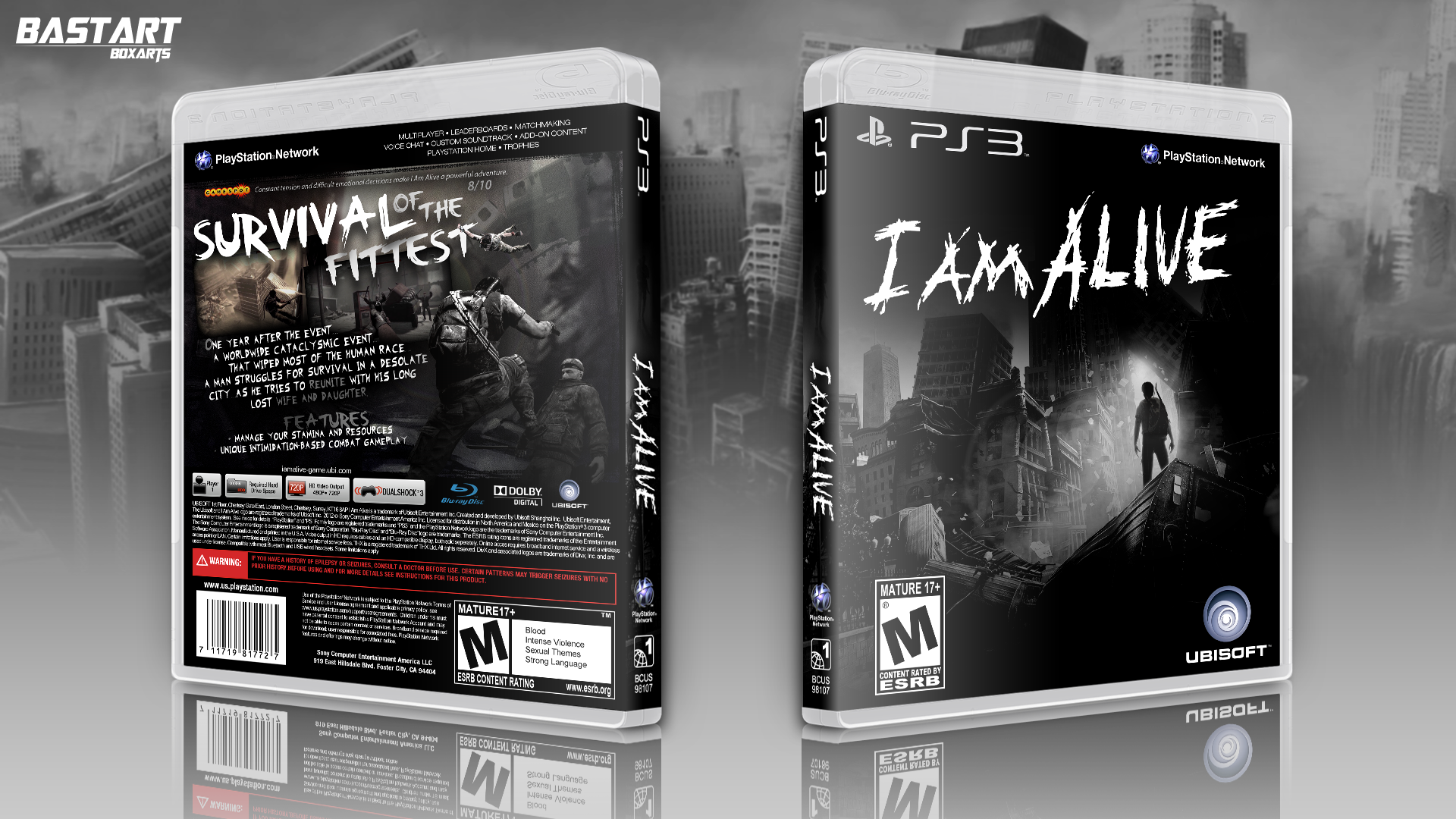
[ Box updated on April 11th, 2012 ] [ original ]
 I Am Alive Box Cover Comments
Comment on Bastart's I Am Alive Box Art / Cover.
Not too sure about the back but the whole box goes together quite well. And I agree for a $15 game, people should not be complaining. My friend has it and I played it, its not bad or anything, yes could have been HUGE if they did it right but whatever lol Im planning on getting it for the 360 sometime soon
[ Reply ]
Thanks ;) I think it's best to wait when the price is reduced (even 15 bucks is a bit high, comparing to the length and achievements)
[ Reply ]
I wish that the front had the also brownish tone but other than that I <3 this.
[ Reply ]
DAT BACK...
Dude I love this.
[ Reply ]
You did it again! Brilliant :D
[ Reply ]
I could really use some pointers from you on making game covers, most notably backs.
[ Reply ]
Thanks ;) to be honest your backs are miles better than mine imo.
[ Reply ]
I like the layout and the box works well but on the front the ESRB should be as far from the left as the ubisoft is from the right and because the front doesn't have any color fading from a tan to gray I think the back could be solid black and white too.
Pretty cool, I think you should do a printable.
[ Reply ]
Thanks for the advice, I totally forgot to add the printable version :/
[ Reply ]
This is great. I love the typography, and the simple use of artwork. It's very atmospheric. I agree with TrevOwnz about the dev logos, though. My only other issue is the presentation. Some people like large presentations. I'm not one of those people. It's not "bad", it just doesn't really add anything to the design. I tend to think of presentations as being like one-page ads in magazines. Looking at this presentation, does it present the box in the best light, as something I would want to buy? Unfortunately, not really. The buildings are so complex that they take away from the box, and the blending of that image into the rest of the background has left a dark border between the two. Finally, it's just so large that the box is small in comparison, and this is, after all, a packaging design site. The box is the star, not the presentation.
[ Reply ]
Yeah, I guess my presentations are really my weak point, I've heard it before though. Anyway, thanks for your honest comment, I appreciate it.
[ Reply ]
I wasn't expecting this much attention at all to be honest, thanks guys for your feedback and fav's :)
I've made an update based on Trevownz suggestions and added a printable version.
[ Reply ]
Wonderful job. The ESRB and Ubisoft logos on the front are a little too big, but other than that you fit the feel of the game perfectly with this.
[ Reply ]
Weird. I thought I favorited this!
[ Reply ]
congrats on HOF!
[ Reply ]
Well, thank you guys :) I really wasn't expecting this to be HOF worthy.
[ Reply ]
Congrats on the hall.
[ Reply ]
Congretz with hall of fame!
[ Reply ]
CONGRATS Man :)
[ Reply ]