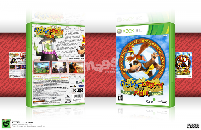
It's been a while since my last cover submission, but here it is.
Some time ago there was a contest that I signed up for, and that for one of its rounds we had to redesign an old cover, using new artwork, but I couldn't submit for entering a tests period. Few days ago I started working on this again, and this is the result.
Some sure if a comeback, but I was happy about this design. Critics are welcome, comments are welcome. Rants too, as far as you explain why.
Credit to Indexenos for the inner borders of the template's plastic.
Thanks to TrevOwnz, KoopaDasher and PoppinsDEBO for their critics.
Also in DeviantART.com: link
______________________________________
Any trademarks are property of its respective owners.
______________________________________
Some rights reserved. This work is licensed under a Creative Commons Attribution-Noncommercial-No Derivative Works 3.0 License.
[ Box updated on April 23rd, 2012 ] [ original ]
 Banjo-Kazooie Box Cover Comments
Comment on Manuel_Alejandro95's Banjo-Kazooie Box Art / Cover.

Looks great man. Really did a good job keeping the original look. If you did get this in the comp you would have done well.
[ Reply ]
Legal information looks perfect. This cover is on a different level of cleanliness, unbelievable. You've got the template down to a science. The way the text wraps around the characters is good too, there's too much stuff on this cover to admire for me to list really.
[ Reply ]
I really hate this game, but MAN.
This box <333
[ Reply ]
Oh wait, this is for the the first one, not Nuts & Bolts.
I take it back, this is my favourite game of all time. <333
[ Reply ]
Dude, what was the process involving being able to match the Japanese Template. Did you basically vector everything yourself?
[ Reply ]
If you're talking about the legal info, I found some hi-res NTSC-J scan from some Ubisoft game cover and based on that, typed the English part changing the company names and other names, removed the Kinect bits it had, and tried blending the Asian characters in, as the background in the scan was plain white (Thinking about it, those characters look more Chinese than Japanese, but the scan still was NTSC-J), the "Warning" part was directly taken from the scan and then edited, the "Supports Family Settings" logo was vectored, as well as the CERO content descriptors.
[ Reply ]
Damn.
[ Reply ]
Solid design. Everything is in the right place, nice and colorful. Why did you decide to make in it japenese though? ã¨ã¦ã‚‚ã™ãã¦ã‚™ã™ã€‚
[ Reply ]
Well, we had to recreate an old box art using new artwork (Or something like that) and I liked the old Japanese B-K box.
[ Reply ]
I HAVE JAPANESE COVERS SO GIVE YOU EMAIL
[ Reply ]
very nice man great work.
[ Reply ]
Nice box , Nice front .
[ Reply ]
Looks fantastic. But I don't like the japanese ^^
But a perfect box imo.
[ Reply ]
can you give you email .i am taiwan
[ Reply ]
You mean you're from there? Pretty nice, but, why should I give you my mail?
[ Reply ]
Aesthetically flawless, really.
[ Reply ]
Sugoi! You did a masterpiece over here!
[ Reply ]
Nice one, had you entered this would have been hard to beat.
[ Reply ]
Great box, glad to see ya back too :)
[ Reply ]
Thanks everyone.
[ Reply ]
My favourite game of all time, and you've done it justice!
[ Reply ]
:O AMAZING!
[ Reply ]
This is really good! (link
[ Reply ]
I think the back could have used a bit of blue but otherwise, a very solid design. Oh, and congrats on the Hall!
[ Reply ]
Wow, amazing job Manuel! Those Japanese characters add a very nice touch to it! Definitely better than the original box.
[ Reply ]
How on Earth do you get the plastic to look like that?
[ Reply ]