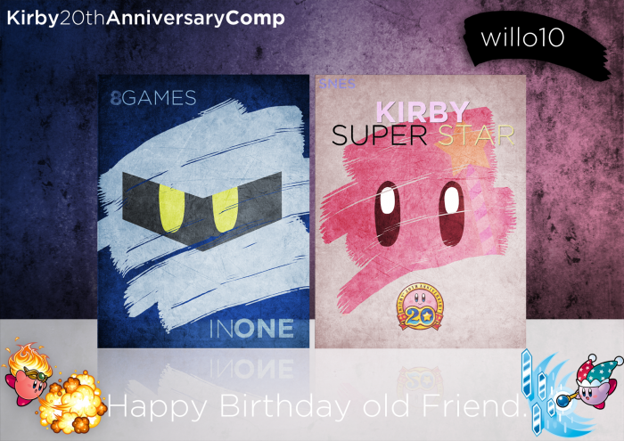
Absolutely Hate the 20th anniversary logo on the front and the snes logo could have been a darker blue. Also u could have made the brush strokes for both sides either go off the edge or kept both not, like on the front. but the rest is brilliant. blue but the rest is brilliant. Great job
This is a great design, but the type throws it off greatly. In all honesty the imagery could have spoken for itself. "8Games...INONE" is totally not needed. And the emblem for the 20th Anniversary Kirby says "Kirby Super Star" more than Kirby Super Star does. SNES in the top corner I think could have done very well centered with the Anniversary Emblem, or if it is justified to the left, place the emblem to the right in the field of negative space.
I'd of sized down the brush stroke effect on the blue side of the box to keep it in conjunction with the right pink side. Also sizing up the eyes of the character so the sharp edges aren't visible, being cut off either side slightly by the brush stroke effect.
All in all, it's a superb design, but it could be a great deal better with some few minor changes. Never be afraid to let negative space speak for itself. Remember, in the design world an empty cup doesn't always need to be filled!
 Kirby Super Star Box Cover Comments
Ohhhhhhh ME GUSTA!
[ Reply ]
Ah, thank you.
I really tried to put my all into this, and I personally think it's my best.
[ Reply ]
Looks fantastic!
Only thing I would change is to have a bit more space between In and One.
[ Reply ]
Absolutely Hate the 20th anniversary logo on the front and the snes logo could have been a darker blue. Also u could have made the brush strokes for both sides either go off the edge or kept both not, like on the front. but the rest is brilliant. blue but the rest is brilliant. Great job
[ Reply ]
What do you hate about the logo?
[ Reply ]
DAYUM!
[ Reply ]
Metaking for the win! Wow, great cover. Really cool. SNES logo seems to disappear, though.
But great design! :)
[ Reply ]
Flexy.
[ Reply ]
You bloody bastard! I want to buy this game right now because of this cover *_*
[ Reply ]
Really cute man :D
[ Reply ]
Very cool
[ Reply ]
Oooh nice!
[ Reply ]
Amazing job, it really looks original.
[ Reply ]
Please do one of these for the Kirby Dream Collection for Wii. If you do, (and maybe add a printable) I can die a happy man.
[ Reply ]
I'll see.
[ Reply ]
Holy.
Fuck.
Thanks you guys. Never would have expected this.
Wow...
[ Reply ]
Congrats my man.
[ Reply ]
Thanks. I appreciate hearing that from you.
[ Reply ]
Congrats on the hall.
[ Reply ]
Amazing design.
[ Reply ]
See, THIS is why I joined this site.
[ Reply ]
This is a great design, but the type throws it off greatly. In all honesty the imagery could have spoken for itself. "8Games...INONE" is totally not needed. And the emblem for the 20th Anniversary Kirby says "Kirby Super Star" more than Kirby Super Star does. SNES in the top corner I think could have done very well centered with the Anniversary Emblem, or if it is justified to the left, place the emblem to the right in the field of negative space.
I'd of sized down the brush stroke effect on the blue side of the box to keep it in conjunction with the right pink side. Also sizing up the eyes of the character so the sharp edges aren't visible, being cut off either side slightly by the brush stroke effect.
All in all, it's a superb design, but it could be a great deal better with some few minor changes. Never be afraid to let negative space speak for itself. Remember, in the design world an empty cup doesn't always need to be filled!
[ Reply ]
link
c'mon check it out.
[ Reply ]
kirby is bossssssssssssssssss
[ Reply ]
Can we get a printable? I'd adore this on my shelf.
[ Reply ]