Hi there!
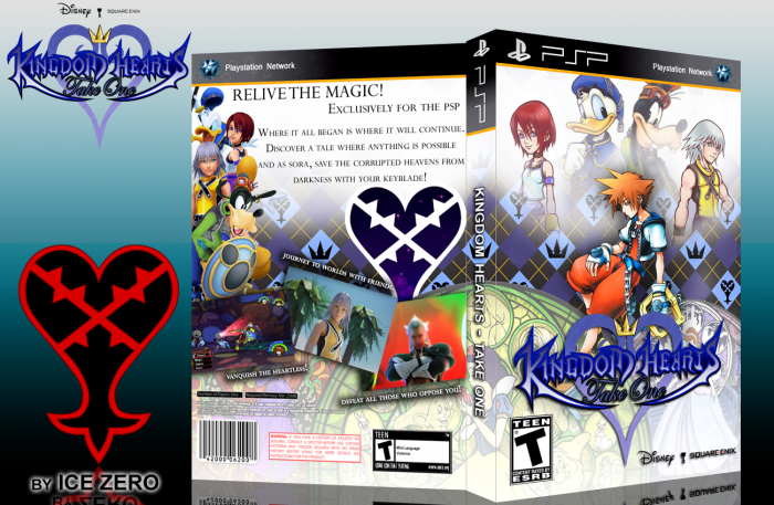
This is my first box and its called Kingdom Hearts - Take One.
This series is a remastered collection series released exclusively for the PSP. so titles like KH2 will become KH - Take Two. Like how people film. Ok so i altered the KH BBS logo heavily to make my own, then i made the wallpaper with the symbols from scratch. I rendered the images of the characters and used my own template. These are supposed to be final fantasy-ish in their composition in that i want to keep it simple but also have it complex as well.
Coming soon - KH Take Between
[ Box updated on May 9th, 2012 ] [ original ]
 Kingdom Hearts: Take One Box Cover Comments
Comment on Ice Zero's Kingdom Hearts: Take One Box Art / Cover.
This is your first? Excellent!
[ Reply ]
Its my first on this account. Thank you so much,
[ Reply ]
Hi there!
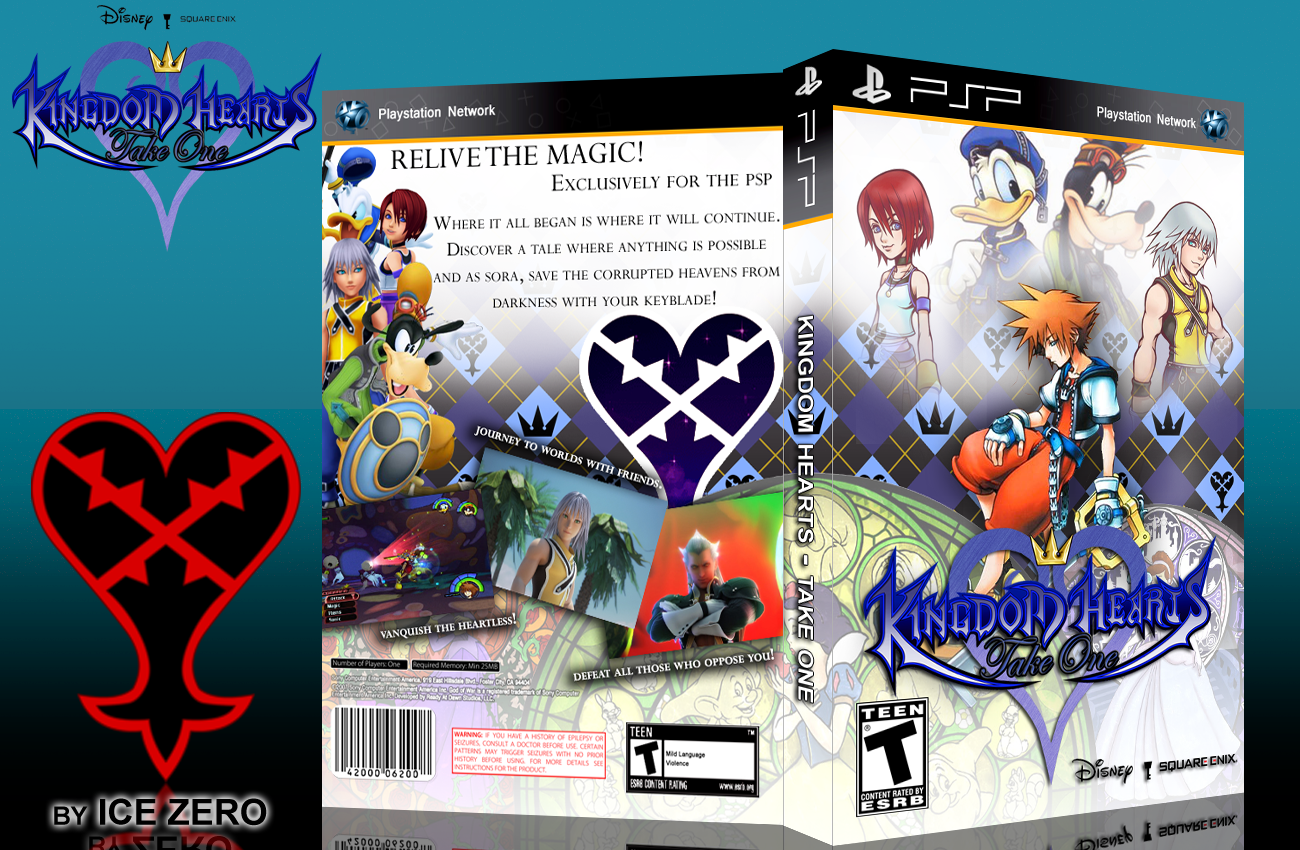
This is my first box and its called Kingdom Hearts - Take One.
This series is a remastered collection series released exclusively for the PSP. so titles like KH2 will become KH - Take Two. Like how people film. Ok so i altered the KH BBS logo heavily to make my own, then i made the wallpaper with the symbols from scratch. I rendered the images of the characters and used my own template. These are supposed to be final fantasy-ish in their composition in that i want to keep it simple but also have it complex as well.
Coming soon - KH Take Between
[ Reply ]
Yeah good job man, impressive!
[ Reply ]
Thank you very much!
[ Reply ]
Nice job on this one. Very fitting to the game.
[ Reply ]
Thanks! Really? Great because that is what I was trying to go for.
[ Reply ]
Very good for a first. Front is good, back could use some work. Text and screens are too big. Placement of the screens also look amateurish.
[ Reply ]
Thanks. Are they really too big? Okay i'll try to fix that. How could i change the placement of the screens to look more pro then?
[ Reply ]