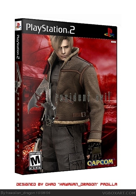
As always, credit to Kracker624 for the template and WickedGamer 1 for the advice on non-distortion. I had to resubmit this because I caught an ugly white line on the box. Enjoy!
I agree with #6.
Heres a font I found link
If you use this simplified version of the main logo instead, it should be less obscured and look better 4/5.

 Resident Evil 4 Box Cover Comments
As always, credit to Kracker624 for the template and WickedGamer 1 for the advice on non-distortion. I had to resubmit this because I caught an ugly white line on the box. Enjoy!
[ Reply ]
#1, nice
[ Reply ]
I still think you should remove some white space.
[ Reply ]
#3, Alright, an update is coming in a minute.
[ Reply ]
#3, The update is there.
[ Reply ]
Good but the 4 on the spine is fine look wired .
4/5
[ Reply ]
Hey guys, can I get some votes?
[ Reply ]
#6, I think that was the only way I could fix it seems. It was either that or a more f'ed up 4.
[ Reply ]
Who gave me the 3.5?
[ Reply ]
As always nice 5/5
[ Reply ]
#10, Thanks.
[ Reply ]
I agree with #6.
Heres a font I found
link
If you use this simplified version of the main logo instead, it should be less obscured and look better 4/5.
[ Reply ]
Much better now. 4.5/5
[ Reply ]
The 4's backward on the spine... insane in the membrain...
[ Reply ]
#14, LOL!!!! i love that saying!
[ Reply ]
the 4 on the spine is backwards, and the text on the front is kinda difficult to read, but overall its a very good box.
you're getting better!
[ Reply ]