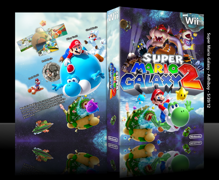
This thing is my baby.
Update: Gonna edit the back on this thing after all the responses. Thanks a lot guys!
 Super Mario Galaxy 2 Box Cover Comments
Comment on Adhiboy's Super Mario Galaxy 2 Box Art / Cover.

The front is outstanding but the I am not sure if the text on the back flows well with the background, maybe lowering the opacity of the outline or discarding it completely would help. Despite that this one of the best covers on the site.
[ Reply ]
I tried to make the text on the back as subtle as obvious, but there came it point where it was too subtle. I wanted to use white text and that just wasn't going to happen with the sky.
Thanks for the other thing you said! I know you're exaggerating a bit but it means a lot to me.
[ Reply ]
good work
[ Reply ]
The front is fantastic work, the back.... not so much. There is no conception, no flow and no real design in the back. The text should be straight and. Try working on this again and assemble the pieces in another way :)
[ Reply ]
I actually think the back is quite nice, although could do with minor changes such as making the screenshots, dash yoshi and rock Mario bigger, and add a tagline on the back. Also something that's been bugging me is the Mario- planet thing (never played this game so sorry lol) is used twice. 5/5
[ Reply ]
Haha, I know. I just couldn't find another planet of appropriate size.
[ Reply ]
hi
[ Reply ]
hi
[ Reply ]
@Adhiboy hello
[ Reply ]
The back is pretty cool, though lots of things on it need to be bigger. The front I feel like I've seen a million times.
[ Reply ]
Front is good but generic, I would love the back if it wasn't for that odd text position.
[ Reply ]
they need to hire u for the special edition version.
[ Reply ]
Fantastic, but I think it would've been better with a different text lay-out on the back. Fav'ed nonetheless. That front is just incredible.
[ Reply ]
Amazing front! The back is OK, but I love that front!
[ Reply ]