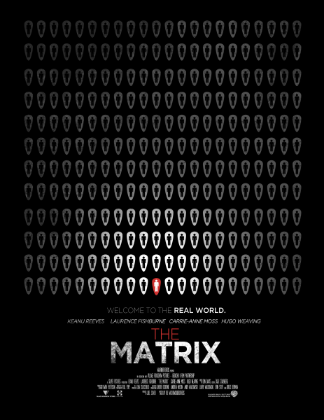
First minimalist poster. Will make more. Hope you enjoy
You must have watched the Matrix to understand the meaning.
This is a final project for my Graphic Art class so I wanted some opinions.
My first try so go easy.
 Minimalist Poster : Matrix Box Cover Comments
Comment on Squall234's Minimalist Poster : Matrix Box Art / Cover.
Making Presentation.
[ Reply ]
So simple, yet explains the movie in a descrete way. Good job man. Its one of those posters that gets your attention right away wondering what it is.
[ Reply ]
Whoa, a comment from you?!
Thanks man!
[ Reply ]
Hoooooly shit.
[ Reply ]
"You take the blue pill – the story ends, you wake up in your bed and believe whatever you want to believe. You take the red pill – you stay in Wonderland and I show you how deep the rabbit-hole goes." -Morpheus
[ Reply ]
The red one really doesn't stand out as much as it should. I don't know what you could do about that ... maybe add a small glow and make it slightly larger? Also, it bothers me that it isn't centered. You should've had an odd number of people in each row so you'd be able to get him right in the center
[ Reply ]
I did add a glow but it looked way to horrid and when he was centred it looked off. The point was not to be perfect and I felt I accomplished that goal =)
Thanks for the comment though!
[ Reply ]
I actually agree with Yoshistar here. My inner OCD is kicking in and the fact the red one isn't in the middle really hurts me. Also the gradient is off, the one in the top-left corner is a different colour to that of the top-right.
[ Reply ]
@tmrd I'm sorry that's its bothering you that badly but as I said before hand, it was suppose to feel random and having the red pod in the center of the row didn't feel right. Also, that's not a gradient but instead a texture overlay. So that's why the colors don't match.
[ Reply ]
@Squall234 I think its perfect where it is now, as you said it should be random.
Your eyes always focuses on the brightess part on a cover or posters first. And you put some light where the red one are, so that make me see it instantly. So it DOES stand out much. Wich is what you want here.
[ Reply ]
interesting man i like it.
[ Reply ]
A very interesting take on The Matrix. I like the fact you didn't used any green color on the poster (The aspect that ussually defines The Matrix art style) The white figure in the red shape doesn't immediately grabs the attention (I agree with the others about if centered it would work even better) but it's different enough to get the focus it needs.
[ Reply ]
So great, even explains a main plot of the movie. Great +fav
[ Reply ]