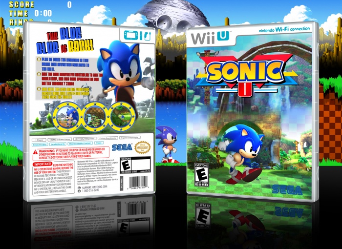
I like the idea of rebooting Sonic back to the classic look/feel in future games. So I kinda like this.
Nice logo, though it might be a wee bit of a mess. (Nitpick)
The front is a little "Meh". First, you've got Sonic just standing still, no incredibly interesting, but then the background is all messy. One, and another, and another, blended together. C'mon! You can do better than that. Next time once you know what you would like it to look like start with something basic, the sky, or the ground, then add clean cut layers that fit seemlessly, this will probably mean rendering them and whatnot. (Building on top of the ground, sky behind land, etc.)
The SEGA logo should have some white behind it, I think there is one like that in the resources you can use.
I think the ESRB should be a bit more in the corner.
And Sonic's shadow is covering a large portion of what should be far behind, in the background. This makes no sense! It should be cut off at the end of the platform on which he stands. Physical continuity/logic is important. Viewers will have negative reactions if something doesn't make any physical sense. (Much like when people make boxes with renders standing on nothing at all, floating.)
The back is cool, but we both know it's but a screen grab from the announcement trailer. Looks cool, but put forth more effort. The text for the tagline is nice, I think it fits, Though you could work on presenting it better. (eg. Adding depth, lighting, texture, a softer shadow behind, that sorta thing. ) The tagline text is nice, but while having a themed font for a tagline is good, keeping that font for the synopsis is not a good move. It doesn't help it stand apart, and can be difficult to read. Try using some basic text fonts (Arials, myriad, etc.) As around for good fonts, I don't know of many. I have trouble there too sometimes. So yeah, use a basic, text font, but use one that fits with the style of your box.
 Sonic U Box Cover Comments
I like the idea of rebooting Sonic back to the classic look/feel in future games. So I kinda like this.
Nice logo, though it might be a wee bit of a mess. (Nitpick)
The front is a little "Meh". First, you've got Sonic just standing still, no incredibly interesting, but then the background is all messy. One, and another, and another, blended together. C'mon! You can do better than that. Next time once you know what you would like it to look like start with something basic, the sky, or the ground, then add clean cut layers that fit seemlessly, this will probably mean rendering them and whatnot. (Building on top of the ground, sky behind land, etc.)
The SEGA logo should have some white behind it, I think there is one like that in the resources you can use.
I think the ESRB should be a bit more in the corner.
And Sonic's shadow is covering a large portion of what should be far behind, in the background. This makes no sense! It should be cut off at the end of the platform on which he stands. Physical continuity/logic is important. Viewers will have negative reactions if something doesn't make any physical sense. (Much like when people make boxes with renders standing on nothing at all, floating.)
The back is cool, but we both know it's but a screen grab from the announcement trailer. Looks cool, but put forth more effort. The text for the tagline is nice, I think it fits, Though you could work on presenting it better. (eg. Adding depth, lighting, texture, a softer shadow behind, that sorta thing. ) The tagline text is nice, but while having a themed font for a tagline is good, keeping that font for the synopsis is not a good move. It doesn't help it stand apart, and can be difficult to read. Try using some basic text fonts (Arials, myriad, etc.) As around for good fonts, I don't know of many. I have trouble there too sometimes. So yeah, use a basic, text font, but use one that fits with the style of your box.
A few points I think you could improve on.
[ Reply ]
Pretty much this. I did like the logo though.
[ Reply ]
Looks actually pretty decent. Nice logo too.
[ Reply ]
nice.
[ Reply ]
Oh god , it's the best Sonic Cover Ever
[ Reply ]
cheers :)
[ Reply ]