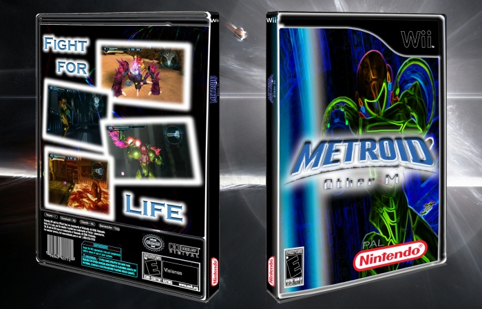
This is a cool concept. I really like the glow, but you took it a bit overboard. For example, it shouldn't be on the legal info or the template. It just made the box look sloppier. The back needs some more text, maybe a description, and the font (copperplate?) does not fit the box, even with the glow. I would also look at the Nintendo logo (way too huge) and the spine which is backwards and the skewing looks atrocious.
 Metroid Other M Box Cover Comments
This is a cool concept. I really like the glow, but you took it a bit overboard. For example, it shouldn't be on the legal info or the template. It just made the box look sloppier. The back needs some more text, maybe a description, and the font (copperplate?) does not fit the box, even with the glow. I would also look at the Nintendo logo (way too huge) and the spine which is backwards and the skewing looks atrocious.
[ Reply ]