THIRD BOX!!!! Give me feedback!! thanks!!
 Super Smash Bros. Unlimited (p23) Box Cover Comments
Comment on WeegeGuy2's Super Smash Bros. Unlimited (p23) Box Art / Cover.
THIRD BOX!!!! Give me feedback!! thanks!!
Comment on WeegeGuy2's Super Smash Bros. Unlimited (p23) Box Art / Cover.
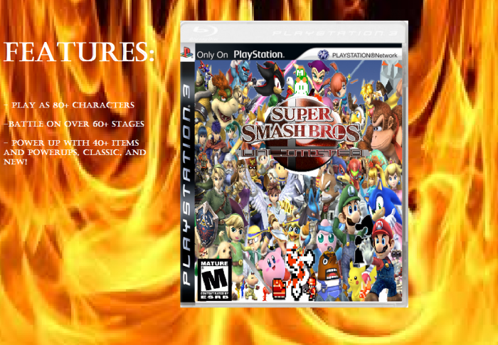
ummm...... It is a little busy and on the wrong console....... Um I suggest refocusing it maybe ummm..... not this.
[ Reply ]
My eyes hurt a lot but:
WAY TOO CRAMMED
Wrong console
M rating?
Paint is very bad to use for boxes
[ Reply ]
No. NO. NOOOOOOOOOOOOOOOOOOOO.
Just stop.
[ Reply ]
look, i can take critics, but you, are just being a jerk. YOU stop looking at my freaking boxes!!! Or at least give me feedback on how i can get BETTER at this!!!!!
[ Reply ]
Allow me to give you a critique:
- First off, abandon the idea that cramming renders on a box will make it look good; it seldom does.
- When looking for renders to place onto the box, try to have them in the same quality, or as much as possible. Avoid blurry images. Go for large images so that you may make them smaller if needed.
- The presentation is blurry and distracting. If you want an eye-catching bpox, make the presentation nice, but not busy. Also, try a reflection for a professional look.
- The tenplate is cut off and square. Make sure you do not use the rectangle marquee tool and just exclude part of the template. It is unattractive and makes your box appear "noobish," if you will.
- The box itself has a messy esrb logo, there is no developer logo (in this case, it should be Nintendo), and there is no main focus, meaning that it just looks like a bunch of random characters on a box.
Jf you sincerely wish to improve, take these things into account for future box art projects. Thank you for reading.
[ Reply ]
Also, like the others have stated before me, use a different program. Paint is not a good one, and you will never get better if you continue usiing it. I suggest (from first-hand experience) using Paint.Net, it is free and it is almost comparable to Photoshop. It takes time to get used to programs like these, so take your time and learn it. Come up with a good box slowly. Do not rush and post your box as if it were a race. Once you are finished and confident in your work, post it. I hope I helped.
[ Reply ]
@Martiniii332 thank you SSSOOOOO much!!! you helped SOO much!!! thanks a million!!!
[ Reply ]