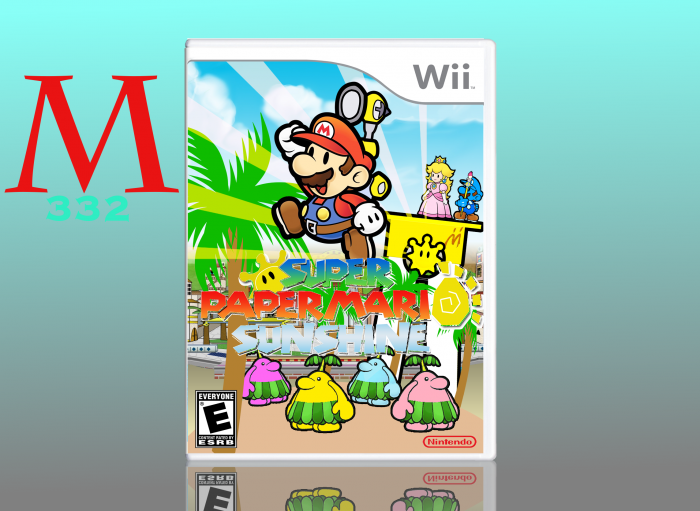
Welp. I pretty much almost gave up on this one, and decided that it was best to post it here and see what everyone had to say. Credit to willo10 for the Mario render and the SPMS logo. I pretty much made everything else that is obviously made. I edited a m=Mario render to look like Shadow Mario. It is okay if you aren't feeling this box, I am not a big fan either, and I would not even be offended. Thanks for viewing.
Really awesome idea! The only problem I see with it is the logo, "Sunshine" is kinda hard to read and part of the outline around the colored text is transparent, I think it would look better as a solid white shadow.
@Martiniii332 Yeah, sorry about that. When I uploaded the logo, I forgot to make the logo transparent. Also, I got a new computer, So I don't have the file anymore.
To be honest, I'm not quite a fan of this one. The renders seem to be floating, for starters. I would recommend adding shadows under them, to make it seem more realistic. And the trees, among other things, could use some work. Try adding black outlines to make it fit with the style of the renders. Finally, the logo. It looks extremely poorly cut out, the white choppyness around it is very unattractive, it should be cut out properly next time. The "Sunshine" part of it is hard to read too, you should add a drop shadow under that as well.
I use Adobe Photoshop CS6, but I evidently did not use it to my full potential. What this was originally supposed to be was a burst of creativity type thing. Looking at this again, I want to delete it. The logo was giving me issues, and I tried to fix it up as mich as possible. I attempted the black-outline-on-the-trees idea, but it came out pretty ugly. I agree eith you, I understand why you may not be feeling this one. Thanks for commenting.
 Super Paper Mario Sunshine Box Cover Comments
Welp. I pretty much almost gave up on this one, and decided that it was best to post it here and see what everyone had to say. Credit to willo10 for the Mario render and the SPMS logo. I pretty much made everything else that is obviously made. I edited a m=Mario render to look like Shadow Mario. It is okay if you aren't feeling this box, I am not a big fan either, and I would not even be offended. Thanks for viewing.
[ Reply ]
Mario*
[ Reply ]
Really awesome idea! The only problem I see with it is the logo, "Sunshine" is kinda hard to read and part of the outline around the colored text is transparent, I think it would look better as a solid white shadow.
[ Reply ]
Thanks, I think I will take care of that tomorrow.
[ Reply ]
I really like it. Some of the logo is hard to make out maybe out line the letters in white. Other wise I really like it.
[ Reply ]
Thank you, appreciate it.
[ Reply ]
@Martiniii332 Yeah, sorry about that. When I uploaded the logo, I forgot to make the logo transparent. Also, I got a new computer, So I don't have the file anymore.
I'm glad you finally finished this, though.
[ Reply ]
@willo10 It's no problem at all, and thanks.
[ Reply ]
To be honest, I'm not quite a fan of this one. The renders seem to be floating, for starters. I would recommend adding shadows under them, to make it seem more realistic. And the trees, among other things, could use some work. Try adding black outlines to make it fit with the style of the renders. Finally, the logo. It looks extremely poorly cut out, the white choppyness around it is very unattractive, it should be cut out properly next time. The "Sunshine" part of it is hard to read too, you should add a drop shadow under that as well.
Also, what program are you using?
[ Reply ]
I use Adobe Photoshop CS6, but I evidently did not use it to my full potential. What this was originally supposed to be was a burst of creativity type thing. Looking at this again, I want to delete it. The logo was giving me issues, and I tried to fix it up as mich as possible. I attempted the black-outline-on-the-trees idea, but it came out pretty ugly. I agree eith you, I understand why you may not be feeling this one. Thanks for commenting.
[ Reply ]