@Discord, Yes, i will try to improve the next time, I belive the back needs some nice screenshots, and perhaps bigger text, different color, and a new font....says Count Bleck.
I love the idea. The front is not bad either. I think the logo should be bigger, though. The back could be better to fit the same excitement the front has. This has potential.
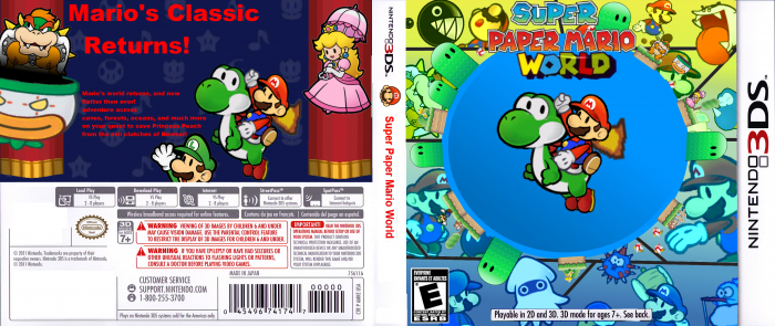
 Super Paper Mario World Box Cover Comments
I like the front. The back is a bit lacking.
[ Reply ]
@Discord, Yes, i will try to improve the next time, I belive the back needs some nice screenshots, and perhaps bigger text, different color, and a new font....says Count Bleck.
[ Reply ]
I love the idea. The front is not bad either. I think the logo should be bigger, though. The back could be better to fit the same excitement the front has. This has potential.
[ Reply ]
I thank you for your feedback, ....says Count Bleck.
[ Reply ]
looks rad
[ Reply ]