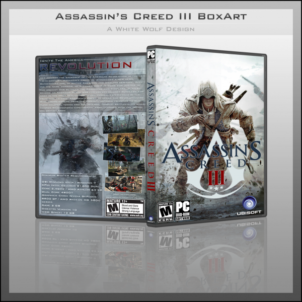
I like the main idea, but i have some things to point out:
-As Bastart the top of the front is a bit empty.
-Again a point from Bastard that the poses are too similar, plus not only the type of artwork but the lighting really makes the front and back feel like they belong on different boxarts.
-The logo seems a bit misplaced, and could've been used to fix the empty space on the top, as the black text would stand out better on top of the white space anyway.
-The spine logo may be a bit oversized.
Just want to help you improve, it's still great for a beginner though, keep up the good work ;)
 Assassin's Creed III Box Cover Comments
Nice job :)
[ Reply ]
Thanks ;)
[ Reply ]
Looks great!
[ Reply ]
Nice front, but the top seems a bit empty to me though :/ also the poses of Connor are too similar and they clash because of the art styles.
[ Reply ]
I like the main idea, but i have some things to point out:
-As Bastart the top of the front is a bit empty.
-Again a point from Bastard that the poses are too similar, plus not only the type of artwork but the lighting really makes the front and back feel like they belong on different boxarts.
-The logo seems a bit misplaced, and could've been used to fix the empty space on the top, as the black text would stand out better on top of the white space anyway.
-The spine logo may be a bit oversized.
Just want to help you improve, it's still great for a beginner though, keep up the good work ;)
[ Reply ]
Really Nice , o__O
[ Reply ]
really good, nice job.
but I believe that you should have added a header for the front(a PC dvdrom logo)but it is verry good
[ Reply ]
not bad but the ubisoft logo is too big.
[ Reply ]