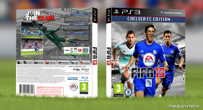
I wanted to design a new Fifa box and I felt, seeing as I'm a Chelsea supporter, it would be cool to make it a Chelsea Edition. I know alot of you probably don't follow Chelsea and thats fine, I just ask u judge the box and not the Chelsea content. I hope you like it.
 FIFA 13: Chelsea FC Edition Box Cover Comments
Comment on TheQuickTech's FIFA 13: Chelsea FC Edition Box Art / Cover.
Good job. I like what you did with the soccer ball.
[ Reply ]
Good looking box, nice presentation. A few things:
On the front I'd remove the Chelsea Logo and place the Fifa Licensed Product logo at the bottom right corner. Would look better imo.
Also I would reconsider the placement of Lampard, Torres and Hazard. The different shirts would look better when Lampard is in the middle. Or you could remove either Torres or Hazard and add the keeper or just any player in the third kit. Since Cech is already on the back I would not put him on the front AND the back.
Furthermore I don't really like the reflection of the screenshots. Because it crosses the Chelsea FC boarding it looks kinda weird to me.
But don't get me wrong, I do like the box. You did a good job :)
[ Reply ]
Great...
[ Reply ]
WOW i really didn't think this box would do this badly :(
[ Reply ]
Nice presentation and I really like the back layout (especially, the ball 'joining' the tagline, nice idea) The front players in the home blue shirts, look a bit 'too blue' imo. I'd suggest too change the contrast (just like the blue on the chelsea edition bar) or make the back right player, also wear the white away shirt.
[ Reply ]
Looks really official. Great job!
[ Reply ]
i send you a mp QuickTechs , and plz can you do the same but for xbox version and not with edition juste a simple fifa cover chelsea plz
[ Reply ]
nice box.. well made especially at the back. my only two criticisms would the the font used on "chelsea fc edition".. you could try and use the fifa font they use on Ultimate Edition cover.. maybe that would look better and if the height of the blue bg on that could be a bit bigger. The Chelsea logo seems out of place where it is positioned at the moment. Otherwise a great cover.
[ Reply ]