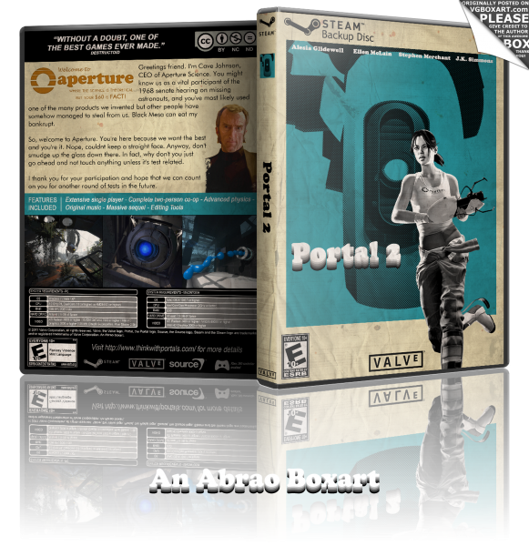
Here you go! Retro look for Portal 2. I've got this idea when I played the game and we explored the Aperture of the 70s. I gave to the paper a used and crumpled look.
I know some people will not like it, especially the font and the logo but I'm ok with that :)
Credit: browen2o for the front GLaDOS. link
 Portal 2 Box Cover Comments
Comment on Abrao's Portal 2 Box Art / Cover.
I don't think the front matches the back to much to be honest. I don't know what it is, but they do not feel the same. That's really my only provlem. The rest of the box is great, and for that, I must fav.
[ Reply ]
Nice Front
[ Reply ]
I don't really like the dunkin' font you've used for the title, but overall the box looks quite original, great job ;)
[ Reply ]
This is really sexy. Well done.
[ Reply ]
Like...
[ Reply ]
Wow, thanks for your comments, much appreciated. I'm surprised by your reactions, I was expecting more negative comments, so I take it as good news.
I know the choice of the font on front would be controversial, but I wanted something to match the 70s, so I chose the Aperture 70s font.
[ Reply ]
Looks real great. But I absolutely HATE the logo in that font. XD
[ Reply ]
I agree, the logo is screwing with me too. It might not look so bizarre if it was just 2D instead of pseudo-3D.
[ Reply ]
@hesit8 My source of insipiration for the front logo: link this kind of pseudo-3D was popular during these times.
[ Reply ]
I actually love that font choice and treatment. Very commodore 64 feel... I really like the halftone effect used on Glados - nice touch there
[ Reply ]
Amazing! Just love it!
[ Reply ]